How to override selected color in theme override for material ui for react
Solution 1
CODE:
const theme = createMuiTheme({
  overrides: {
    MuiTabs: {
      indicator: {
        backgroundColor: orange[700]
      }
    },
    MuiTab: {
      root: {
        "&:hover": {
          backgroundColor: pink[100],
          color: pink[700]
        }
      },
      selected: {
        backgroundColor: orange[100],
        color: orange[700],
        "&:hover": {
          backgroundColor: green[100],
          color: green[700]
        }
      }
    }
  }
});
LIVE EXAMPLE: https://codesandbox.io/s/mj9x1zy4j9
Solution 2
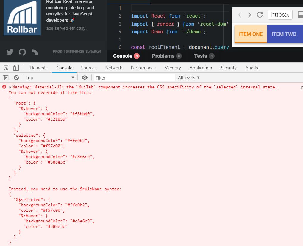
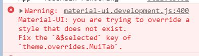
The CodeSandbox example in the accepted answer no longer works in the latest version of MUI (3.9.1) and when I try to fix the issue with the suggested change, it gives yet another error message. See screen captures below. See solution below.
eps1lon showed me how to do this on this code sandbox. This should now be the accepted answer.
Solution 3
also possible to use TabIndicatorProps
<Tabs
  value={value}
  onChange={this.handleChange}
  TabIndicatorProps={{
    style: {
      backgroundColor: "#D97D54"
    }
  }}
>
...
</Tabs>
if you need none-indicator
const theme = createMuiTheme({
  overrides: {
    MuiTabs: {
      indicator: {
        backgroundColor: `transparent`
      }
    },
Solution 4
In order to override the selected rule, you need to use the $ruleName syntax.
The rule override should be inside the root definition:
(Forked code sandbox with the fixed syntax)
const theme = createMuiTheme({
  overrides: {
    MuiTabs: {
      indicator: {
        backgroundColor: orange[700]
      }
    },
    MuiTab: {
      root: {
        "&:hover": {
          backgroundColor: pink[100],
          color: pink[700]
        },
        "&$selected": {
          backgroundColor: orange[100],
          color: orange[700],
          "&:hover": {
            backgroundColor: cyan[500],
            color: green[700]
          }
        }
      }
    }
  }
});
Related videos on Youtube
 12 : 23
![Material UI Theme Override and Props in React JS [Global Styles]](https://i.ytimg.com/vi/mu8-u7V7Z8s/hq720.jpg?sqp=-oaymwEcCNAFEJQDSFXyq4qpAw4IARUAAIhCGAFwAcABBg==&rs=AOn4CLCwQVW8KD5iJx-9m5KoyR8bXHtR7A) 18 : 49
18 : 49
 12 : 04
 38 : 38
 13 : 05
Glenn
Updated on June 04, 2022Comments
-
Glenn almost 2 years
I would like to override the selected text color for all tabs in material ui for React. I know I can override some portions with code such as this:
const theme = createMuiTheme({
  overrides: {
    MuiTab: {
      root: {
        color: '#000000',
        backgroundColor: '#ffffff',
        '&:hover': {
          backgroundColor: 'rgba(108, 130, 168, 0.11764705882352941)',
          color: '#000000',
        }
      }
    }
  }
});
followed by
 <MuiThemeProvider theme={theme}>
    <HomePage/>
 </MuiThemeProvider>
However, when the tab is selected it applies a class such as '.MuiTab-textColorPrimary-144.MuiTab-selected-146'. How can I specify a global override color for textColorPrimary for the Tab component when it is selected? I'm specifically interested in a global override and not an individual instance override. Lacking a specific way for the Tab component, how would I specify a global override for 'selected' primaryTextColor?
-
Glenn over 5 yearsThis is an awesome answer and is an example of why we all love stackoverflow. Adding a codesandbox link is really icing on the cake and is much appreciated. Thanks!
-
 Robert VASILE over 5 yearsnice to know it helped, especially since i'm less than a week into react+mui frontend dev :)
 -
Glenn over 5 yearsI've asked a related question about setting height of material-ui Toolbar in this question: stackoverflow.com/questions/52043271/…
-
 Lambert about 5 yearsSee upgraded syntax below for latest version of Material-UI
 -
Devin Venable over 3 yearsLamber's note below is correct. The example above needs to be updated. Now the selected selector needs this format. Note the dollar sign. '&$selected': {backgroundColor: 'brown'}