Responsive CSS Circles
Solution 1
Solution:
The DIV structure:
We use overflow:hidden in .x2 for spill off background colors in .x3
of child elements.
Notice the content starts inside of .x3
<div class="x0">
<div class="x1">
<div class="x2">
<div class="x3">
<!-- BEG Content -->
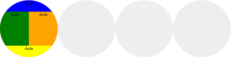
<div class="x4">
dude
</div>
<div class="x6">
<div class="x7">
dude
</div>
<div class="x8">
dude
</div>
</div>
<div class="x5">
dude
</div>
<!-- END Content -->
</div>
</div>
<div class="x2"></div>
<div class="x2"></div>
<div class="x2"></div>
</div>
</div>
The CSS:
@media (max-width: 320px)
{
    .x2 {padding: 50%;}
}

@media (min-width: 321px) and (max-width: 800px)
{
    .x2 {padding: 25%;}
}

@media (min-width: 801px)
{
    .x1 {width:800px}
    .x2 {padding: 12.5%;}
}
.x0 {
    float:left;
    width:100%;
}
.x1 {
    margin:0px auto;
}
.x2 {
    overflow:hidden;
    display:block;
    float:left;
    width:auto;
    height:auto;
    position: relative;
    border-radius:50%;
    -moz-border-radius:50%;
    -webkit-border-radius:50%;
    -khtml-border-radius: 50%;
    background:#eee;
}
.x3 {
    position: absolute;
    width: 100%;
    left: 0;
    top:0;
    font-size: 100%;
    float:left;
    height:100%;
    background-color:red;
}
/* BEG Content */
.x3 div{float:left;}
.x4,.x5,.x6 {
    width:100%;
}
.x7,.x8 {
    width:50%;
    float:left;
    height:100%;
}
.x4,.x5,.x7,.x8 {
    text-align:center;
}
.x4 {
    background-color:blue;
    height:20%;
}
.x5 {
    background-color:yellow;
    height:20%;
}
.x6 {
    height:60%;
}
.x7 {
    background-color:green;
}
.x8 {
    background-color:orange;
}
/* END Content */
Solution 2
You don't need @media queries for this. This is my try, pure CSS:
.x1 {
overflow:hidden;
}
.x1 .x2 {
display:block;
float:left;
padding: 12.5%;
width:auto;
height:auto;
border-radius:50%;
-moz-border-radius:50%;
-webkit-border-radius:50%;
-khtml-border-radius: 50%;
background:#eee;
text-align:center;
position: relative;
}
.x1 .x2 span {
position: absolute;
width: 100%;
left: 0;
top: 48%;
line-height: 1em;
height: 1em;
font-size: 100%;
overflow: hidden;
}
Solution 3
Shorter Code
This solution reduces your code size but keeps the functionality in place. I've kept the original .x#, eliminating the .x0, .x3, and .x6 that were not needed. So in a final solution, you would probably renumber (but I wanted you to see what was eliminated).
Any of your pieces "splitting" the circle that require a different top or left setting will need to have a selector that meets or exceeds the .x2 > div selector to override, hence why I have .x2 > .x7 etc. for some of my selectors.
(As noted in the comments below, Chrome has bug issues with the original technique the OP had posted at the time of the bounty starting. This does not solve those, so view the following in another browser.)
Here's the modified fiddle.
HTML
<div class="x1">
        <div class="x2">
                <!-- BEG Content -->
                <div class="x4">
                    dude
                </div>
                <div class="x7">
                    dude
                </div>
                <div class="x8">
                    dude
                </div>
                <div class="x5">
                    dude
                </div>
                <!-- END Content -->
        </div>
        <div class="x2"></div>
        <div class="x2"></div>
        <div class="x2"></div>
    </div>
CSS
.x1 {
    margin:0px auto;
}
.x2 {
    overflow:hidden;
    display:block;
    float:left;
    width:auto;
    height:auto;
    position: relative;
    border-radius:50%;
    -moz-border-radius:50%;
    -webkit-border-radius:50%;
    -khtml-border-radius: 50%;
    background:#eee;
}

/* BEG Content */
.x2 > div {
    position: absolute;
    text-align: center;
    top: 0;
    left: 0;
}
.x4,.x5 {
    width:100%;
    height: 20%;
}
.x2 > .x7, .x2 > .x8 {
    width:50%;
    height: 60%;
    top: 20%;
}
.x4 {
    background-color:blue;
}
.x2 > .x5 {
    background-color:yellow;
    top: 80%;
}

.x7 {
    background-color:green;
}
.x2 > .x8 {
    background-color:orange;
    left: 50%;
}
/* END Content */
@media (max-width: 320px)
{
    .x2 {padding: 50%;}
}

@media (min-width: 321px) and (max-width: 800px)
{
    .x2 {padding: 25%;}
}

@media (min-width: 801px)
{
    .x1 {width:800px}
    .x2 {padding: 12.5%;}
}
EDIT: Based on comments, it appears the OP desired something more like the control this fiddle offers (not functional in Chrome; the OP has not at the time of this edit replied for me to know if that is the type of functionality desired or not).
Comments
-
Dan Kanze over 3 years
Goal:
Responsive CSS circles that:
- Scale with equal radius.
- Radius can be calculated by percent.
- Radius can be controlled by media queries.
If solution is javascript, I still need to emulate media query triggers. I dont 'need' media queries but I do want the ability to control the radius by percentage at certain widths:
@media (max-width : 320px)
{
    .x2{padding: 50%;}
}

@media (min-width : 321px) and (max-width : 800px)
{
    .x2{padding: 25%;}
}

@media (min-width: 801px)
{
    .x2{padding: 12.5%;}
}
Here is what I have so far:
<div class="x1">
    <div class="x2">
        lol dude
    </div>
    <div class="x2"></div>
    <div class="x2"></div>
    <div class="x2"></div>
</div>

.x1
{
    float:left;
    width:100%;
}

.x2
{
    display:block;
    float:left;
    padding: 12.5%;          //Currently being used to control radius.
    width:auto;
    height:auto;
    border-radius:50%;
    -moz-border-radius:50%;
    -webkit-border-radius:50%;
    -khtml-border-radius: 50%;
    background:#eee;
    text-align:center;
}
Problems:
In this solution, when content is added to a circle:
- The shape contorts when scaled past it's available padding.
- Increases the size of the radius.
Update:
I've built a working solution for this here: Responsive CSS Circles