How to create a polygon shape div
Solution 1
One method could be to split the image into two containers which are 50% the size of the parent, transform each of them separately and position the backgrounds to look like they are one single image. The transform could either be a skew (used in the answer) or a perspective based rotation.
Note that since we are transforming the container, we have to apply the reverse effect to the actual image for it to look normal.
.image {
  position: relative;
  height: 150px;
  width: 450px;
  overflow: hidden;
}
.top-container,
.bottom-container {
  position: absolute;
  left: 0px;
  height: 50%;
  width: 100%;
  overflow: hidden;
  backface-visibility: hidden;
}
.top-container {
  top: 0px;
  transform-origin: right bottom;
  transform: skew(-20deg);
}
.bottom-container {
  bottom: 0px;
  transform-origin: right top;
  transform: skew(20deg);
  background-position: 0% 100%;
}
.top-container:after,
.bottom-container:after {
  position: absolute;
  content: '';
  height: 100%;
  width: 100%;
  left: -14px;  /* tan(20) * (height/2) / 2 */
  background: url(http://lorempixel.com/450/150);
  background-size: 100% 200%;
}
.top-container:after {
  top: 0px;
  transform: skew(20deg);
}
.bottom-container:after {
  bottom: 0px;
  transform: skew(-20deg);
  background-position: 0% 100%;
}

/* Just for demo */

body {
  background: linear-gradient(90deg, crimson, indianred, purple);
}
.image2 {
  margin-top: 10px;
  height: 150px;
  width: 450px;
  background: url(http://lorempixel.com/450/150);
}
<div class="image">
<div class='top-container'></div>
<div class='bottom-container'></div>
</div>
<!-- this is the actual image for comparison -->
<h3>Original Image</h3>
<div class='image2'></div>I was about to suggest usage of SVG and clipPath but since Persijn has already posted that sample, I have added below a different version with polygon.
.vector {
  position: relative;
  height: 150px;
  width: 450px;
}
svg {
  position: absolute;
  top: 0px;
  left: 0px;
  height: 100%;
  width: 100%;
}
polygon {
  fill: url(#image);
}

/* Just for demo */

body {
  background: linear-gradient(90deg, crimson, indianred, purple);
}
<div class='vector'>
<svg viewBox='0 0 450 150' preserveAspectRatio='none'>
<defs>
<pattern id='image' height='150' width='450' patternUnits='userSpaceOnUse'>
<image xlink:href='http://lorempixel.com/450/150' height='150' width='450' />
</pattern>
</defs>
<polygon points='15,0 450,0 450,150 15,150 0,75' />
</svg>
</div>Solution 2
SVG
Solution found by Jbutler438
using a clip-path and image tag in svg you can easily cut out an arrow shape at the front.
<?xml version="1.0" ?>
<svg width="300px" height="300px" viewBox="0 0 100 100" version="1.1" xmlns="http://www.w3.org/2000/svg">

  <defs>
    <clipPath id="myClip">
      <path d="M30 0, 100 0, 100 100, 30 100 0,50Z" />
    </clipPath>
  </defs>

  <image xlink:href="http://lorempixel.com/300/300" x="0" y="0" width="100%" height="100%" clip-path="url(#myClip)" />


</svg>Related videos on Youtube
 15 : 19
 18 : 29
 04 : 35
 02 : 41
 11 : 37
 03 : 41
 01 : 30
 01 : 07
Comments
-
Jan P. over 1 year
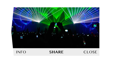
I would like to create HTML element like on image here:
A problem is the DIV element has polygon shape instead of regular rectangle, will be placed above other elements as something like popup and inside that element there is necessary to show an image with rectangular shape in source but showed on web like filling all space included triangle on the left side.
Do you think is there any possibility to realize that without preparing showed images as transparent PNGs in proper polygon format? Only by CSS3 transform or use canvas or SVG?
-
Jan P. almost 9 yearsYes, as @Harry mentioned SVG is second way to solve that and thank you very much for code snippet. I will try both ways. Guys on the StackOverflow, you are the best:]
-
intcreator over 8 yearsWould this work if you had a slider element on an HTML page that you wanted to display with the polygon edge?
-
 Harry over 8 years@brandaemon: Yes, that should be possible. Here is a sample fiddle. The code is just a quick attempt and not at all optimized though.
 -
intcreator over 8 yearsHmm...would it be possible to keep the shape static and only change the images? That's more what I was thinking.
-
Harry over 8 years@brandaemon: Here is a sample with static shape and only images moving :)
-
intcreator over 8 yearsSweet! I was playing with it but apparently I have no idea what I'm doing