Circular percent progress bar
Solution 1
Considering the shape of the progress bar (rounded end/start) I would suggest using SVG.
DEMO: Radial progress bar
In the following example, the progress is animated with the stroke-dasarray attribute and the % numbers are incremented with jQuery:
var count = $(('#count'));
$({ Counter: 0 }).animate({ Counter: count.text() }, {
  duration: 5000,
  easing: 'linear',
  step: function () {
    count.text(Math.ceil(this.Counter)+ "%");
  }
});
body{text-align:center;font-family: 'Open Sans', sans-serif;}
svg{width:25%;}<script src="https://ajax.googleapis.com/ajax/libs/jquery/2.1.1/jquery.min.js"></script>
<svg id="animated" viewbox="0 0 100 100">
<circle cx="50" cy="50" r="45" fill="#FDB900"/>
<path fill="none" stroke-linecap="round" stroke-width="5" stroke="#fff"
stroke-dasharray="251.2,0"
d="M50 10
a 40 40 0 0 1 0 80
a 40 40 0 0 1 0 -80">
<animate attributeName="stroke-dasharray" from="0,251.2" to="251.2,0" dur="5s"/>
</path>
<text id="count" x="50" y="50" text-anchor="middle" dy="7" font-size="20">100%</text>
</svg>Unfortunatly IE doesn't support svg SMIL animations. To achieve the same result with IE support, you can use a library like snap.svg and animate the stroke-dasharray attribute with JS :
var count = $(('#count'));
$({ Counter: 0 }).animate({ Counter: count.text() }, {
  duration: 5000,
  easing: 'linear',
  step: function () {
    count.text(Math.ceil(this.Counter)+ "%");
  }
});

var s = Snap('#animated');
var progress = s.select('#progress');

progress.attr({strokeDasharray: '0, 251.2'});
Snap.animate(0,251.2, function( value ) {
    progress.attr({ 'stroke-dasharray':value+',251.2'});
}, 5000);
body{text-align:center;font-family:sans-serif;}
svg{width:25%;}<script src="https://ajax.googleapis.com/ajax/libs/jquery/2.1.1/jquery.min.js"></script>
<script src="https://cdnjs.cloudflare.com/ajax/libs/snap.svg/0.3.0/snap.svg-min.js"></script>
<svg id="svg" viewbox="0 0 100 100">
<circle cx="50" cy="50" r="45" fill="#FDB900"/>
<path fill="none" stroke-linecap="round" stroke-width="5" stroke="#fff"
stroke-dasharray="1,250.2"
d="M50 10
a 40 40 0 0 1 0 80
a 40 40 0 0 1 0 -80"/>
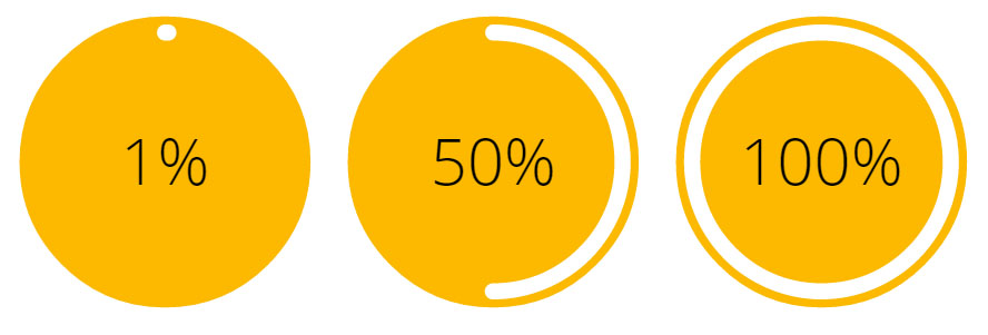
<text x="50" y="50" text-anchor="middle" dy="7" font-size="20">1%</text>
</svg>
<svg viewbox="0 0 100 100">
<circle cx="50" cy="50" r="45" fill="#FDB900"/>
<path fill="none" stroke-linecap="round" stroke-width="5" stroke="#fff"
stroke-dasharray="125.6,125.6"
d="M50 10
a 40 40 0 0 1 0 80
a 40 40 0 0 1 0 -80"/>
<text x="50" y="50" text-anchor="middle" dy="7" font-size="20">50%</text>
</svg>
<svg id="animated" viewbox="0 0 100 100">
<circle cx="50" cy="50" r="45" fill="#FDB900"/>
<path id="progress" stroke-linecap="round" stroke-width="5" stroke="#fff" fill="none"
d="M50 10
a 40 40 0 0 1 0 80
a 40 40 0 0 1 0 -80">
</path>
<text id="count" x="50" y="50" text-anchor="middle" dy="7" font-size="20">100%</text>
</svg>Solution 2
Pure HTML/CSS Solution
In short, I used the CSS border-radius and z-index properties to create a white half circle layered beneath an orange center circle and orange outer ring. Initially, the half-circle is completely hidden behind an additional layer of orange on the left side, but its outer edge is gradually revealed as it rotates around the center axis (via CSS transform: rotate()), creating the appearance of a progress bar. Additional trickery is required once the progress bar passes the halfway point (see below the snippet for more info).
All of this was done with pure HTML and CSS, except the animation, which uses JavaScript. It may appear to require more code than the SVG-based solutions, but the markup is actually much simpler, which makes it a good alternative in my opinion.
function setProgress(elem, percent) {
  var
    degrees = percent * 3.6,
    transform = /MSIE 9/.test(navigator.userAgent) ? 'msTransform' : 'transform';
  elem.querySelector('.counter').setAttribute('data-percent', Math.round(percent));
  elem.querySelector('.progressEnd').style[transform] = 'rotate(' + degrees + 'deg)';
  elem.querySelector('.progress').style[transform] = 'rotate(' + degrees + 'deg)';
  if(percent >= 50 && !/(^|\s)fiftyPlus(\s|$)/.test(elem.className))
    elem.className += ' fiftyPlus';
}

(function() {
  var
    elem = document.querySelector('.circlePercent'),
    percent = 0;
  (function animate() {
    setProgress(elem, (percent += .25));
    if(percent < 100)
      setTimeout(animate, 15);
  })();
})();
.circlePercent {
position: relative;
top: 26px;
left: 26px;
width: 96px;
height: 96px;
border-radius: 50%;
background: orange;
}
.circlePercent:before,
.circlePercent > .progressEnd {
position: absolute;
z-index: 3;
top: 2px;
left: 45px;
width: 6px;
height: 6px;
border-radius: 50%;
background: white;
-ms-transform-origin: 3px 46px;
transform-origin: 3px 46px;
content: "";
}
.circlePercent:after,
.circlePercent > .progress {
position: absolute;
-ms-transform-origin: 48px 48px;
transform-origin: 48px 48px;
z-index: 0;
top: 0;
left: 0;
width: 48px;
height: 96px;
border-radius: 48px 0 0 48px;
background: orange;
content: "";
}
.circlePercent.fiftyPlus:after {
background: white;
-ms-transform: rotate(180deg);
transform: rotate(180deg);
}
.circlePercent > .progress.progress {
background: white;
}
.circlePercent > .counter {
position: absolute;
box-sizing: border-box;
z-index: 2;
width: 100px;
height: 100px;
margin-top: -2px;
margin-left: -2px;
border-radius: 50%;
border: 4px solid orange;
}
.circlePercent > .counter:before {
position: absolute;
z-index: 1;
top: 50%;
margin-top: -13px;
width: 100%;
height: 26px;
font-size: 26px;
line-height: 26px;
font-family: sans-serif;
text-align: center;
color: white;
content: attr(data-percent) "%";
}
.circlePercent > .counter:after {
position: absolute;
width: 80px;
height: 80px;
top: 6px;
left: 6px;
border-radius: 50%;
background: orange;
content: "";
}
.circlePercent > .counter[data-percent="100"] {
background: white;
}<div class="circlePercent">
<div class="counter" data-percent="0"></div>
<div class="progress"></div>
<div class="progressEnd"></div>
</div>Notice that the fiftyPlus class is added to the container element once the progress bar reaches the halfway point. This adds a static progress bar to the right half of the circle. Without it, the progress will appear to drain out of the right side instead of filling in the left side.
Solution 3
Demo : CODEPEN
Here is my attempt at getting the percentage circle indicator:
Path draws two arches and i set the stroke-dasharray. we don't really need to set the dasharray since we set that later with javascript.
Html
<svg class="circles" viewbox="0 0 200 200">
  <g id="first">
    <circle r="50" cx="100" cy="100" fill="#fb0"/>
    <path fill="none"
          stroke-linecap="round"
          stroke-width="7"
          stroke="#ffa"
          stroke-dasharray="250,250"
          d="M100 60
             A1 1 0 0 1 100 140
             A1 1 0 0 1 100 60"/>
    <text class="circ-text"
          text-anchor="middle"
          x="100" y="100"
          font-size="12px"
          fill="#ffa"
          >percentage
    </text>
  </g>
</svg>
Javascirpt
- Get the path with
#first path. - Get the length of the dash-array:
path.getTotalLength(); - Increase the dash-array until its full:
setAttribute('stroke-dasharray', i+","+length);Where i is increased. - Find out what percentage we are at:
(count++/ticks)*100 - add the percentage to the svg text:
text.innerHTML=(count/tick)*100
var path = document.querySelector('#first path');
var text = document.querySelector('#first .circ-text');
var length = path.getTotalLength();
var i = 0;
var count = 0;
var ticks = 50;
setInterval(function() {
  if (i < length+length/ticks) {
    path.setAttribute('stroke-dasharray', i+","+length);
    i+=length/ticks;
    text.innerHTML=Math.round((count++/ticks)*100);
  }

}, 100);
var path = document.querySelector('#first path');
var text = document.querySelector('#first .circ-text');
var length = path.getTotalLength();
var i = 0;
var count = 0;
var ticks = 50;
setInterval(function() {
  if (i < length+length/ticks) {
  	path.setAttribute('stroke-dasharray', i+","+length);
    i+=length/ticks;
    text.innerHTML=Math.round((count++/ticks)*100);
  }

}, 100);
<svg class="circles" viewbox="0 0 500 200">
<g id="first">
<circle r="50" cx="100" cy="100" fill="#fb0" />
<path fill="none" stroke-linecap="round" stroke-width="7" stroke="#ffa" stroke-dasharray="250,250" d="M100 60 A1 1 0 0 1 100 140
A1 1 0 0 1 100 60" />
<text class="circ-text" text-anchor="middle" x="100" y="100" font-size="12px" fill="#ffa">percentage</text>
</g>Solution 4
Circular Percent Progress bar using Canvas ...
var ctx = document.getElementById('circularLoader').getContext('2d');
var al = 0;
var start = 4.72;
var cw = ctx.canvas.width;
var ch = ctx.canvas.height;
var diff;
function progressSim(){
	diff = ((al / 100) * Math.PI*2*10).toFixed(2);
	ctx.clearRect(0, 0, cw, ch);
	ctx.lineWidth = 17;
	ctx.fillStyle = '#4285f4';
	ctx.strokeStyle = "#4285f4";
	ctx.textAlign = "center";
	ctx.font="28px monospace";
	ctx.fillText(al+'%', cw*.52, ch*.5+5, cw+12);
	ctx.beginPath();
	ctx.arc(100, 100, 75, start, diff/10+start, false);
	ctx.stroke();
	if(al >= 100){
		clearTimeout(sim);
	    // Add scripting here that will run when progress completes
	}
	al++;
}
var sim = setInterval(progressSim, 50);
<div id="loader">
<canvas id="circularLoader" width="200" height="200"></canvas>
</div>See Demo :- http://codingflag.in/mysketch.php?sketch=9
Solution 5
Have you tried this?
<percent-display percent="75" side="" colors=""></percent-display>
Source: http://angularscript.com/angularjs-round-percentage-bar-directive-ngpercentdisplay/
dhrm
Updated on July 09, 2022Comments
-
dhrm almost 2 years
I would like to have an percent circle indicator on my site:

In this case it's showing 75%. How should this be done? I have the yellow circle in a image-file, but if it's easier to, some how, do it all using CSS, that's okay with me.
-
 Alvaro Montoro about 9 yearsThis looks really neat. But for some reason the animation does not work for me on IE11 (the number grows, but the white bar is always at a 100%)
 -
web-tiki about 9 years@AlvaroMontoro unfortunatly, IE doesn't support svg SMIL animations. But you can achieve the same result using a library like snap.svg codepen.io/web-tiki/pen/qEGvMN?editors=101 this works in latest FF, chrome and IE.
-
 Persijn about 9 yearsThe percentage indicator dos not seem to work in IE but the circle around does. ANy one have a sugestion on how to fix this?
 -
 Max Payne about 9 yearsNice! btw why don't you remove the three inanimate circles in the second example?Its causing the real animated circle to hide!
 -
 Alexandr_TT over 3 years@web-tiki Unfortunately, your excellent answer is currently not working correctly. Apparently, something has changed in browser support or frameworks used.
 -
web-tiki over 3 years@Alexandr_TT Thx for reporting. I saw an issue in chrome and added a fix. Can you confirm it also works for you please? If not, can you please tell me what browser you are using?
-
Alexandr_TT over 3 years@web-tiki Thanks for the quick response and solution! Before the fix, the problem was found in Chrome, Firefox, Opera I checked, now it works in these browsers!
-
 Najam Us Saqib about 3 yearswhat if we want 180 degree progress bar.
 -
web-tiki about 3 years@NajamUsSaqib I suggest you ask another question as it is not relevant to the question asked here