Creating a responsive cloud shape
Solution 1
The cloud shape can be created using SVG with a single path element in SVG. SVGs by nature are scalable without causing any distortions to the shape. The browser support for SVG is very good and fallback for IE8 and lower (if needed) can be provided using VML.
Shape Creation
The commands used in drawing the shape and their meaning are as follows:
-
M 25,60- This command moves the pen to a point which is 25px ahead of the origin (0,0) on X-axis and 60px ahead of the origin on Y-axis. (Note: The command is written in uppercase which indicates that it isabsolutemovement and notrelativemovement). -
a 20,20 1 0,0 0,40- This command creates an arc whose X and Y radii are 20px. The arcs starting point is at (25,60) and the end point is (25,100) (that is, 0px away in X-axis and 40px away in Y-axis). -
h 50- This command draws a horizontal line that is 50px ahead in relation to the starting point. Since it is relative, the end point would be at (75,100). -
a 20,20 1 0,0 0,-40- Similar to the second command, this creates another arc whose radii are 20px on either axis and its end point is 40px before in relation to the previous point. So in essence this would create an arc from (75,100) to (75,60). This and the second command together form the arcs on the two sides of the cloud. -
a 10,10 1 0,0 -15,-10- Another arc command to create one portion of the curved top of the cloud. The radii are 10px and the arc would be from (75,60) to (60,50). -
a 15,15 1 0,0 -35,10- The final arc to complete the cloud. Radii are 15px and the arc would be from (60,50) to (25,60). (25,60) was the original starting point and thus completes the shape. -
z- Closes the path.
svg {
  height: 50%;
  width: 50%;
}
path {
  fill: white;
  stroke: black;
  stroke-width: 2;
  stroke-linejoin: round;
}
path:hover {
  fill: aliceblue;
  stroke: lightskyblue;
}
<svg viewBox='0 0 105 105'>
<path d='M 25,60
a 20,20 1 0,0 0,40
h 50
a 20,20 1 0,0 0,-40
a 10,10 1 0,0 -15,-10
a 15,15 1 0,0 -35,10
z' />
</svg>Advantages of using SVG
- They are easy to create and maintain
- The commands are simple enough to understand and requires no complex positioning or hacks
- They are scalable (responsive) by default
- There are no extra HTTP requests required as long as the SVG is inline
- Better control over the arcs, their radii etc
- Hover effects (like shown in the snippet below) can be restricted to trigger only when mouse is within the boundaries of the shape.
- Extra effects can be added in a hassle free manner. That is, you can mimic the behavior of the shape being drawn on screen etc.
Extra Effects - Cloud Drawing Animation
Below is a sample snippet with a cloud drawing animation where the path is drawn by repeatedly decrementing the stroke-dashoffset property of the path until it becomes 0. The initial offset value is equal to the total length of the path which is calculated using the getTotalLength() method. The cloud shape also has a blur shadow added.
Animation is achieved using the window.requestAnimationFrame method.
window.onload = function() {
  var offset;
  var path = document.getElementsByTagName('path')[0];
  var len = path.getTotalLength();

  function paint() {
    path.style.strokeDashoffset = len;
    path.style.strokeDasharray = len + ',' + len;
    animate();
  }

  function animate() {
    if (!offset) offset = len;
    offset -= 0.5;
    path.style.strokeDashoffset = offset;
    if (offset < 0)
      window.cancelAnimationFrame(anim);
    else anim = window.requestAnimationFrame(function() {
      animate();
    });
  }

  paint();
};
svg {
height: 40%;
width: 40%;
}
path {
fill: white;
stroke: black;
stroke-width: 2;
stroke-linejoin: round;
}
path:hover {
fill: aliceblue;
stroke: lightskyblue;
}<svg viewBox='0 0 105 105'>
<filter id='shadow'>
<feGaussianBlur in='SourceAlpha' stdDeviation='2' />
<feOffset dx='2' dy='0' result='blur' />
<feMerge>
<feMergeNode in='blur' />
<feMergeNode in='SourceGraphic' />
</feMerge>
</filter>
<path d='M 25,60
a 20,20 1 0,0 0,40
h 50
a 20,20 1 0,0 0,-40
a 10,10 1 0,0 -15,-10
a 15,15 1 0,0 -36,10
z' filter='url(#shadow)' />
</svg>Solution 2
Puffy clouds and rainbows.
Disclaimer: There are no rainbows here
However, below is a basic 'cloud', made with a single element, and, since it is using vw units, it is also fairly responsive.
It uses two pseudo elements, shaped as circles, to create the clouds 'puffs' on the top. This also allows a border to be used as you can rotate the circles and appl y a border color to two of the sides.
.cloud {
  height: 30vw;
  width: 90vw;
  background: lightgray;
  border-radius: 40vw;
  border: 5px solid black;
  position: relative;
  margin-top: 20vw;
}
.cloud:before {
  content: "";
  position: absolute;
  top: -10vw;
  box-sizing: border-box;
  height: 20vw;
  width: 20vw;
  left: 15vw;
  border-radius: 50%;
  border: 5px solid black;
  border-bottom-color: transparent;
  border-right-color: transparent;
  background: lightgray;
  transform: rotate(40deg);
}
.cloud:after {
  content: "";
  position: absolute;
  height: 40vw;
  width: 40vw;
  top: -20vw;
  left: 32vw;
  border-radius: 50%;
  box-sizing: border-box;
  border: 5px solid black;
  border-bottom-color: transparent;
  background: lightgray;
  border-right-color: transparent;
  transform: rotate(55deg);
}
<div class="cloud"></div>Whilst this answer is using CSS, it may be more beneficial using an SVG if you required more control over the output of the cloud shape.
Alternatively, an SVG could also achieve such a shape using the path declaration (please note this was generated, not manually created and so I do not take credit for it):
<svg version="1.1" id="Capa_1" xmlns="http://www.w3.org/2000/svg" xmlns:xlink="http://www.w3.org/1999/xlink" x="0px" y="0px"viewBox="0 0 512 512" style="enable-background:new 0 0 512 512;" xml:space="preserve">
  <g>
    <path d="M320,128c52,0,95,42,96,94c-0,1-0,3-0.5,5l-0.812,23l22,7
		C462,268,480,293,480,320c0,35-28,64-64,64H96c-35,0-64-28-64-64c0-34,28-63,63-64
		c1,0,3,0,4,0l24,1l8-22C140,209,165,192,192,192c3,0,6,0,11,1
		l22,4.031l11-19C253.875,146,285,128,320,128 M320,96c-47,0-89,26-111,65
		C203,160.719,197,160,192,160c-41,0-77.219,27-90.281,64.563C99.813,224.438,97.969,224,96,224c-53,0-96,43-96,96
		s43,96,96,96h320c53,0,96-43,96-96c0-41-27-77-64-90C447.5,227.75,448,225.938,448,224
		C448,153,390,96,320,96L320,96z" />
  </g>
</svg>Related videos on Youtube
 15 : 54
 04 : 35
 16 : 34
 04 : 14
 01 : 28
 01 : 41
 01 : 45
Comments
-
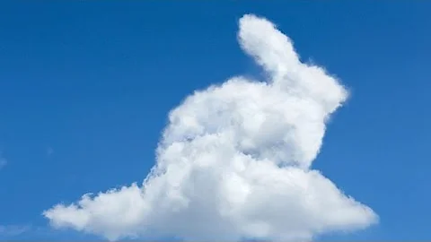
Stewartside almost 2 years
I've been trying to create a responsive cloud shape in CSS for a project. I am trying not to do this with images, CSS or inline SVG due to HTTP requests and the requirement for responsiveness.
The shape in question would be this: (but can be similar - slight variations/improvements would be cool):

I have found both of these questions but they don't seem to suit my exact needs:
I have attempted (and failed) at creating a cloud with a
borderorbox-shadowand need to know if this is possible with CSS or as an alternative, inline SVG. Ive also seen Canvas is an option too but I would prefer to stay away from that as it can be quite complicated.This is my poor attempt
body {
  background: skyblue;
}

.cloud {
  width: 15%;
  height: 10vh;
  background: white;
  position: relative;
  margin: 100px 100px;
  border-radius: 65px;
  box-shadow: black 0 0 10px 10px;
}
.cloud:after {
  content: '';
  position: absolute;
  width: 150px;
  height: 150px;
  top: -60px;
  left: 100px;
  border-radius: 75px;
  background: white;
}
.cloud:before {
  content: '';
  position: absolute;
  width: 70px;
  height: 70px;
  background: white;
  left: 50px;
  top: -30px;
  border-radius: 35px;
}
<div class="cloud"></div>As you can see, I'm having trouble with the responsiveness and calculating exactly what heights/widths everything needs to be.
I am also trying to keep the amount of HTML down to an absolute minimum, and so would really prefer to use a single div or short SVG code.