How do I create a teardrop in HTML?
Solution 1
SVG approach:
You can achieve the double curve easily with an inline SVG and the <path/> element instead of the <polygon/> element which doesn't allow curved shapes.
The following example uses the <path/> element with:
- 2 quadratic bezier curve commands for the 2 top curves (lines beginning with
Q) - 1 arc command for the big bottom one (line beginning with
A)
<svg width="30%" viewbox="0 0 30 42">
  <path fill="transparent" stroke="#000" stroke-width="1.5"
        d="M15 3
           Q16.5 6.8 25 18
           A12.8 12.8 0 1 1 5 18
           Q13.5 6.8 15 3z" />
</svg>
SVG is a great tool to make this kind of shapes with double curves. You can check this post about double curves with an SVG/CSS comparison. Some of the advantages of using SVG in this case are:
- Curve control
- Fill control (opacity, color)
- Stroke control (width, opacity, color)
- Amount of code
- Time to build and maintain the shape
- Scalable
- No HTTP request (if used inline like in the example)
Browser support for inline SVG goes back to Internet Explorer 9. See canIuse for more information.
Solution 2
Basic Border-Radius
You can do this within CSS relatively easily using border-radius' and transforms. Your CSS was just a little bit out.
.tear {
  width: 50px;
  height: 50px;
  border-radius: 0 50% 50% 50%;
  border: 3px solid black;
  transform: rotate(45deg);
  margin-top: 20px;
}
<div class="tear"></div>Advanced Border-Radius
This will be very similar to above but gives it a bit more shape.
.tear {
  width: 50px;
  height: 50px;
  border-radius: 80% 0 55% 50% / 55% 0 80% 50%;
  border: 3px solid black;
  transform: rotate(-45deg);
  margin-top: 20px;
}
<div class="tear"></div>Solution 3
Your main issue with your CSS code was:
- You used a different height than width
- You haven't rotated the correct angle size
So, by 'fixing' these issues, you would generate:
.tear {
  display: inline-block;
  transform: rotate(-45deg);
  border: 5px solid green;
  width: 100px;
  height: 100px;
  border-top-left-radius: 50%;
  border-bottom-left-radius: 50%;
  border-bottom-right-radius: 50%;
}
/***for demo only***/

.tear {
  margin: 50px;
}
<div class="tear">
</div>Please also note to save on CSS length, you could re-write your border-radius properties to:
border-radius: 50% 0 50% 50%;
this could be enhanced with pseudo elements as shown in this fiddle
Alternatives
I found this by Vinay Challuru on codepen.
Please note that with the logic here, I was able to create the SVG to nearly any possible build shape/etc. For example, a quick output was:
<svg viewBox='0 0 400 400'>
  <path fill="none" stroke="#333" stroke-width="5" d="M200,40 C200,115 280,180 280,240 A80,80,0 0,1,120,240 C120,180 200,115 200,40" stroke-linejoin='miter'></path>
</svg>
It's using an SVG and allows you to alter the shape in multiple ways, having the ability to alter its shape to the desired result:
var SVG = function() {
  this.element = document.getElementsByTagName("svg")[0];
  this.namespace = "http://www.w3.org/2000/svg";
  this.width = 400;
  this.height = 400;
}

/****Let's initialise our SVG ready to draw our shape****/
var svg = new SVG();

/****This sets up the user interface - we've included the script for this as an external library for the codepen****/
var gui = new dat.GUI();

/****Here's where the code to create the shape begins!****/
var Teardrop = function() {
  this.x = svg.width * 0.5;
  this.y = svg.height * 0.1;
  this.width = svg.width * 0.4;
  this.triangleHeight = svg.height * 0.5;
  this.yCP1 = svg.height * 0.2;
  this.yCP2 = svg.height * 0.45;
  this.element = null;
  this.ctrlPoints = [];
  this.anchors = [];
  this.fill = "none";
  this.stroke = "#333";
  this.strokeWidth = 2;
  this.showCtrlPoints = true;
  this.init();
}

Teardrop.prototype.init = function() {
  this.element = document.createElementNS(svg.namespace, "path");
  svg.element.appendChild(this.element);
  this.element.setAttribute("fill", this.fill);
  this.element.setAttribute("stroke", this.stroke);
  this.element.setAttribute("stroke-width", this.strokeWidth);

  for (var i = 0; i < 3; i++) {
    this.ctrlPoints.push(document.createElementNS(svg.namespace, "circle"));
    svg.element.appendChild(this.ctrlPoints[i]);

    this.ctrlPoints[i].setAttribute("fill", this.fill);
    this.ctrlPoints[i].setAttribute("stroke", 'red');
    this.ctrlPoints[i].setAttribute("stroke-width", 1);


    this.anchors.push(document.createElementNS(svg.namespace, "line"));
    svg.element.appendChild(this.anchors[i]);

    this.anchors[i].setAttribute("stroke-width", 1);
    this.anchors[i].setAttribute("stroke", this.stroke);
    this.anchors[i].setAttribute("stroke-dasharray", "3,2");
  }

  this.draw();
}

Teardrop.prototype.draw = function() {
  this.radius = this.width / 2;
  path = [
    "M", this.x, ",", this.y,
    "C", this.x, ",", this.yCP1, " ", this.x + this.width / 2, ",", this.yCP2, " ", this.x + this.width / 2, ",", this.y + this.triangleHeight,
    "A", this.radius, ",", this.radius, ",", "0 0,1,", this.x - this.width / 2, ",", this.y + this.triangleHeight,
    "C", this.x - this.width / 2, ",", this.yCP2, " ", this.x, ",", this.yCP1, " ", this.x, ",", this.y
  ];
  this.element.setAttribute("d", path.join(""));

  cpCoords = [];
  cpCoords[0] = [this.x, this.yCP1];
  cpCoords[1] = [this.x - this.width / 2, this.yCP2];
  cpCoords[2] = [this.x + this.width / 2, this.yCP2];

  anchorCoords = [];
  anchorCoords[0] = [this.x, this.y];
  anchorCoords[1] = [this.x - this.width / 2, this.y + this.triangleHeight];
  anchorCoords[2] = [this.x + this.width / 2, this.y + this.triangleHeight];

  for (var i = 0; i < 3; i++) {
    this.ctrlPoints[i].setAttribute("cx", cpCoords[i][0]);
    this.ctrlPoints[i].setAttribute("cy", cpCoords[i][1]);

    this.anchors[i].setAttribute("x1", cpCoords[i][0]);
    this.anchors[i].setAttribute("x2", anchorCoords[i][0]);
    this.anchors[i].setAttribute("y1", cpCoords[i][1]);
    this.anchors[i].setAttribute("y2", anchorCoords[i][1]);

    if (this.showCtrlPoints) {
      this.ctrlPoints[i].setAttribute("r", 2);
      this.anchors[i].setAttribute("stroke-width", 1);
    } else {
      this.ctrlPoints[i].setAttribute("r", 0);
      this.anchors[i].setAttribute("stroke-width", 0);
    }
  }
}

var teardrop = new Teardrop();

gui.add(teardrop, 'triangleHeight', 0, svg.height * 0.75);
gui.add(teardrop, 'width', 0, 200);
gui.add(teardrop, 'yCP1', 0, svg.height);
gui.add(teardrop, 'yCP2', 0, svg.height);
gui.add(teardrop, 'showCtrlPoints', 0, svg.height);

for (var i in gui.__controllers) {
  gui.__controllers[i].onChange(function() {
    teardrop.draw();
  });
}
html,
body {
height: 100%;
}
svg {
display: block;
margin: 0 auto;
background: url('http://unitedshapes.com/images/graph-paper/graph-paper.png');
}<script src="//cdnjs.cloudflare.com/ajax/libs/dat-gui/0.5/dat.gui.min.js"></script>
<svg width='400px' height='400px'></svg>Disclaimer I did not write the above pen, only sourced it.
CSS Version
Although this is far from complete, you may also be able to generate this shape using CSS.
.tear{
    height:200px;
    width:200px;
    background: linear-gradient(to bottom, rgba(0,0,0,0) 0%,rgba(0,0,0,0) 29%,rgba(0,0,0,1) 30%,rgba(0,0,0,1) 100%);
    border-radius:50%;
    margin:120px;
    position:relative;
}
.tear:before{
    content:"";
    position:absolute;
    top:-70%;left:0%;
    height:100%;width:50%;
    background: radial-gradient(ellipse at -50% -50%, rgba(0,0,0,0) 0%,rgba(0,0,0,0) 75%,rgba(0,0,0,1) 76%,rgba(0,0,0,1) 100%);
}
.tear:after{
    content:"";
    position:absolute;
    top:-70%;left:50%;
    height:100%;width:50%;
    background: radial-gradient(ellipse at 150% -50%, rgba(0,0,0,0) 0%,rgba(0,0,0,0) 75%,rgba(0,0,0,1) 76%,rgba(0,0,0,1) 100%);
}
<div class="tear"></div>SVG Version
I should know that SVG should be at the top of this answer, however, I like a challenge and so here is an attempt with SVG.
svg {
  height: 300px;
}
svg path {
  fill: tomato;
}
<svg xmlns="http://www.w3.org/2000/svg" xmlns:xlink="http://www.w3.org/1999/xlink" version="1.1" viewBox="0 0 100 100">
<path d="M49.015,0.803
c-0.133-1.071-1.896-1.071-2.029,0
C42.57,36.344,20,43.666,20,68.367
C20,83.627,32.816,96,48,96
s28-12.373,28-27.633
C76,43.666,53.43,36.344,49.015,0.803z
M44.751,40.09
c-0.297,1.095-0.615,2.223-0.942,3.386
c-2.007,7.123-4.281,15.195-4.281,24.537
c0,5.055-2.988,6.854-5.784,6.854
c-3.189,0-5.782-2.616-5.782-5.831
c0-11.034,5.315-18.243,10.005-24.604
c1.469-1.991,2.855-3.873,3.983-5.749
c0.516-0.856,1.903-0.82,2.533,0.029
C44.781,39.116,44.879,39.619,44.751,40.09z"/>
</svg>Altering the path values, you would be able to alter the shape of your teardrop design.
Solution 4
IMO this shape requires smooth curve-to beziers to ensure continuity of the curve.
The Drop in question :
For the drop in question,
- smooth curves can't be used, as control points wont be of same length. But we still need to make the control points lie exactly opposite (180 deg) to the previous control points, to ensure full continuity of curve The picture given below illustrates this point :
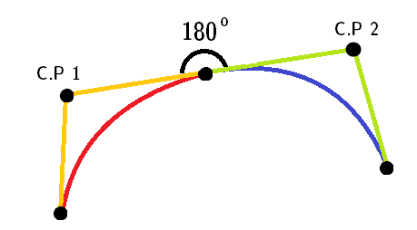
Note: Red and blue curves are two different quadratic curves.
stroke-linejoin="miter", for the pointed top part.AS this shape only uses successive
ccommands, we can omit it.
Here's the final snippet:
<svg height="300px" width="300px" viewBox="0 0 12 16">
  <path fill="#FFF" stroke="black" stroke-width="0.5" stroke-linejoin="miter"
        d="M 6 1 c -2 3 -5 5 -5 9
           0 7 10 7 10 0
           0 -4 -3 -6 -5 -9z" />
</svg>
TBH though, accepted answer's curves are not quite continuous.
For IE 5-8 (VML)
Only works in IE 5-8. VML uses different commands than SVG. Eg. it uses v for relative cubic beziers.
Note: This snippet won't run in IE 5-8 too. You need to create an html file and run it directly in the browser.
<!DOCTYPE HTML PUBLIC "-//W3C//DTD HTML 4.01 Transitional//EN">
<html xmlns:v="urn:schemas-microsoft-com:vml">
<head>
    <style> v\:* { behavior: url(#default#VML); }

    </style >
</head>
<body>
    <div style="width:240; height:320;">
        <v:shape coordorigin="0 0" coordsize="12 16" fillcolor="white" strokecolor="black" strokewidth="1"
            strokeweight="5" style="width:240; height:320"
            path="M 6 1 v -2 3 -5 5 -5 9
           0 7 10 7 10 0
           0 -4 -3 -6 -5 -9 x e">
        </v:shape>
    </div>
</body>
</html>
Solution 5
Or if your viewers' font supports it, use the Unicode characters
DROPLET: 💧 (💧)
or
BLACK DROPLET: 🌢 (🌢)
Scale accordingly!
Related videos on Youtube
 10 : 24
 03 : 43
 02 : 02
 12 : 42
 03 : 32
 03 : 33
 10 : 44
 01 : 24
 03 : 17
 17 : 21
 21 : 24
 01 : 14
Persijn
After so much bad community managment, the case with a respected moderator and some of my most trusted members of the community leaving i will no longer be active in this community. Because JavaScript can be used without understanding, the understanding of the language is often never attained. -kyle simpson
Updated on February 10, 2020Comments
-
Persijn about 4 years
How do I create a shape like this to display on a webpage?
I don't want to use images since they would get blurry on scaling
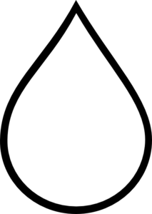
I tried with CSS:
.tear {
  display: inline-block;
  transform: rotate(-30deg);
  border: 5px solid green;
  width: 50px;
  height: 100px;
  border-top-left-radius: 50%;
  border-bottom-left-radius: 50%;
  border-bottom-right-radius: 50%;
}
<div class="tear"> </div>That turned out really screwed.
And then I tried with SVG:
<svg viewBox="0 100 100">
  <polygon points="50,0 100,70 50,100 0,70"/>
</svg>
It did get the shape, but the bottom part wasn't curved.
Is there a way to create this shape so it can be used in an HTML page?
-
Seblor almost 9 yearsYou can create the shape you want here (and see the code by clicking one of the top buttons) : svg-edit.googlecode.com/svn/trunk/editor/svg-editor.html#group
-
zzzzBov almost 9 years"I don't want to use images since they would get blurry on scaling", why are you scaling the image? They don't get blurry if you use
[srcset]or the<picture>element. Better yet, just link to an svg image:<img src="tear.svg" alt="Teardrop"/> -
 jbutler483 almost 9 years@zzzzBov: Are you really recommending the
pictureelement? No support for IE, no support for early versions of Chrome, no support for safari. Should i continue? -
zzzzBov almost 9 years@jbutler483, I recommend SVG for this case, but after that, yes i'm recommending the
<picture>element, along with Picturefill and an appropriate noscript fallback. -
Nolonar almost 9 years@zzzzBov.
why are you scaling the image?Well, the image can appear blurry without the dev scaling it. All you need for that is a browser zooming in. In my case, I have a HighDPI screen and plenty of blurry images. So, yeah, if you can avoid images using SVG, go for it. -
 Thomas Weller almost 9 yearsUnicode solves it all... U+1F4A7 💧
 -
 user000001 almost 9 years@Thomas I see a square :/ i.stack.imgur.com/8fXMf.png
 -
 Netorica almost 9 yearsI think "droplet" is more appropriate to use for the title of this question?
 -
user253751 almost 9 years@jbutler483 Safari and IE maybe, but who cares about early versions of Chrome? Especially since Chrome all but forces you to auto-update.
-
Andreas Rejbrand almost 9 yearsSemantically and practically, I think you should use an image for this. But, of course, you should not use a raster graphics image (not PNG, and definitely not JPG, God no), but a vector graphics image (that is, in practice, SVG).
-
Persijn almost 9 yearsThere are benefits to both using a css and svg solution to achieve this shape.
-
Volvox almost 9 years@immibis older mobile phones may not get updates for browsers
-
 Salman A almost 9 yearsWhy not change the title of question to "drop of water"?
 -
technosaurus almost 9 years@SalmanA ... because a teardrop is the best description for this shape. An actual drop of water (not on a surface) looks more like a jelly fish without tentacles... though most people do recognize a teardrop as the symbol for rain, this is a combination of tricks of the eye in fast motion of a rain drop interpolated to more observable slower flow of a teardrop
-
-
 Anonymous almost 9 years@Persijn Yes, read the top: "which was used to create the following"
 -
Persijn almost 9 yearsWhy would you use a line inside a defs tag? And can't you do this shape in one path not 3 + a rect?
-
Stewartside almost 9 years@zzzzBov I don't fully understand how it is the wrong tool, OP asked for a CSS or SVG solution and i came up with a CSS solution which fits the description as close as possible. Its lightweight and easy to modify.
-
 Abhinav Gauniyal almost 9 years@Persijn why do you keep asking copied from some editor? Svg is svg , you can use whichever tool you want to create one.
 -
zzzzBov almost 9 yearsNowhere in the question does it state that CSS or SVG is a requirement. OP just posted his own attempts and asked "Is there anyway to create this shape so it can be used in a html page?" This answer suggests using CSS, which is not an appropriate way of generating what is semantically an image.
-
Persijn almost 9 years@AbhinavGauniyal this is a coding site, so I prefer solutions made by hand/coded.
-
Stewartside almost 9 years@zzzzBov Using CSS for images and sprites is common use. It is a very minimal piece of code to generate a generic "Image". I believe it is appropriate because it is usable within the questions spec of being usable on a web page.
-
jbutler483 almost 9 years@zzzzBov: CSS is perfectly fine for shapes. Who's to say what such shape is used for? semantically an image - OP has clearly stated they do not wish to use an image, otherwise why else would such a question be asked?
-
jbutler483 almost 9 years@AbhinavGauniyal: 'editors' as you like to call them, add extra 'fluff' to declarations. For example,
300.000000ptand metadata that's not really needed -
Abhinav Gauniyal almost 9 years@Persijn what do you mean by hand/coded. Someone just made/hand/coded illustrator to just ease their coding tasks, and it still produces the same thing. Then again when you're using svg in browser, why don't you yourself hand/code it using assembly language? and why stop at assembly , hand/code it using wires or just draw it yourself. This is not a reason that I was expecting.
-
Abhinav Gauniyal almost 9 years@jbutler483 yes and they can be trimmed out. There are many tools that do that for you , here's one for you github.com/svg/svgo
-
zzzzBov almost 9 years@jbutler483, "CSS is perfectly fine for shapes" no, it's awful. Just because you can doesn't mean you should. It introduces all sorts of garbage in markup, and is a tedious mess to maintain. Images are much simpler to maintain as they are easily separated into their own individual self-contained file.
-
Persijn almost 9 years@AbhinavGauniyal Join me in chat: chat.stackoverflow.com/rooms/69317/css-shapes-and-designs
-
user428517 almost 9 years@persijn this answer provides the svg paths needed. i really have no clue what your objection is.
-
egid almost 9 yearsThese all seem very... verbose. The js solution is particularly absurd.
-
technosaurus almost 9 yearsit can reduce to:
<svg width="100%" height="100%" viewBox="0 0 8 8" /> <path d="M4 1L3 4A1.2 2 0 1 0 5 4"/> </svg>... this will fill the area you give it, so it may make "fat" or "skinny" raindrops ... change to fixed height/width if necessary -
web-tiki almost 9 years@technosaurus the problem with reducing the number of commands in the
d="..."attribute is that you don't have the double curve at the top of the drop anymore. -
jbutler483 almost 9 years@zzzzBov: I'm guessing you're just one of those people who don't like shapes. That's fine. But I suppose you'd also use an image for the likes of a circle just because it's more 'symantic' to do so. Whilst yes, for some items an image would be a smaller size than that of a css file, but in most cases, why add an extra http call when you can (quite happily) reduce this by using a short piece of css.
-
jbutler483 almost 9 years'Garbage in the markup' occurs when you use bootstrap, or font awesome icons. Seriously, I think you're going a bit over the top for the likes of this when (quite obviously) this can be achieved using a border radius declaration. But hay, who's to tell you not to use images?
-
Stan Rogers almost 9 years@zzzzBov: If it's decoration, it requires no markup at all; a
:beforeor:afterwill do. If it's content ("semantically an image"), you can use an appropriate small image and alt text for fallback (CSS load failure, user settings, accessibility) and still use CSS to get something that scales well. SVG works as well, but it should only take two lines and an arc in a single stroked path to get the job done. -
sareed almost 9 yearsCSS can be a completely valid solution. @zzzzBov if a client demanded a non-standard li bullet i.e. checkmark, triangle, whatever, would you use an image? Or would you use :before? If you would use something else please leave a comment, I like learning new methods.
-
 doppelgreener almost 9 yearsThis doesn't resemble the kind of teardrop being asked for, though.
 -
 1934286 almost 9 yearsYou could use this with @font-face, but then you have a font file to keep in the right place and such.
 -
Persijn almost 9 yearsRuddy the pen is missing a background color value.
-
 Ruddy almost 9 years@Persijn Harry said something in chat and I was looking at it on that pen forgetting it auto saves every now and then. Haha, I will put it back the way it was. Done.
 -
Simba almost 9 years+1 because you should use SVG for this, not CSS. The CSS features you'd need to achieve it have about the same browser support as SVG so there's no advantage for CSS on that score. CSS can do shapes, but that's not what it's designed for; don't try to hammer in a nail with a screwdriver just for the sake of being clever when you can do it just as well with a tool designed for the job.
-
Andreas Rejbrand almost 9 yearsEven better: create a SVG file and use
<img />in the hypertext document. -
Andreas Rejbrand almost 9 yearsSVG and a dedicated Unicode symbol like this is good. CSS for this is bad. PNG is okay, but not perfect since it is raster graphics. JPG is extremely bad, so bad that I would get nightmares if I saw it.
-
Jeremy Dicaire almost 9 yearsFor CSS, it's amazing - but I prefer the SVG approach
-
 Max Payne almost 9 yearsI dont see how svg is better option always. it certainly is better option in many cases like this one. But canvas has its own pros. Nice answer. from your answer i can make out that, it certainly is a lot easier to use SVG!
 -
 Harry almost 9 yearsYeah @TimKrul, its easier to write/use SVG. Canvas has its own pros but from whatever I read it is not too advantageous when using for simple logo like shapes primarily because it is raster based unlike SVG.
 -
jbutler483 almost 9 years@egid: I did state in my answer that I did not create the js version. Also note the js version is allowing you to alter the shape at run time
-
nico almost 9 years@AndreasRejbrand a 20x20 PNG would scale worst than a 200x200 JPG. And, with the same size, an uncompressed JPG is equivalent to a PNG. They are both raster and they suffer from the same issues.
-
Andreas Rejbrand almost 9 years@nico: In theory, yes, you can use JPG with zero compression. But the Internet is full of disasters like this one: en.wikipedia.org/wiki/Atomic_number#/media/…
-
web-tiki almost 9 years@AndreasRejbrand that can be a good idea depending on the project but it adds a HTTP request which OP seems to want to avoid.
-
Niccolo M. almost 9 years"smooth curves can't be used, as control points wont be of same length." Doesn't "smooth" just mean that the tangent handles (control points) sit on a straight line? Why do they have to be of the same length?
-
Max Payne almost 9 years@NiccoloM. In svg, smooth curve (T and S commands) means that the handle is symmetrically opposite, as well as equal to previous handle's length. In normal language, smooth curve might mean different handle lengths, but in svg, the length also is equal to previous curves handle :)