Overlapping circles in CSS with 1 div
Solution 1
With CSS box-shadows
You can use multiple box-shadows with several colours on a rounded div. They need to be seperated by a comma:
#circles {
  background-color: red;
  width: 100px;
  height: 100px;
  border-radius: 50%;
  box-shadow: 10px 0 0 -2px #f8ff00,
              20px 0 0 -4px #009901,
              30px 0 0 -6px #3531ff;
}
<div id="circles"></div>output :
Browser support for box-shadows is IE9+ (for more info see canIuse)
You can also make the overlapping circles shape responsive according to the width of the viewport with vw units : DEMO
#circles {
  background-color: red;
  width: 20vw;
  height: 20vw;
  margin: 0 auto;
  border-radius: 50%;
  box-shadow: 2vw 0 0 -0.4vw #f8ff00,
              4vw 0 0 -0.8vw #009901,
              6vw 0 0 -1.2vw #3531ff;
}
<div id="circles"></div>Browser support for vw units is IE9+ (for more info see canIuse)
With SVG
Another approach would be to use an inline svg with the <circle> element.
This is responsive according to the size of the parent and browser support goes back to IE9 like box-shadows :
svg{width:80%;}<svg viewbox="0 0 100 30">
<circle cx="59" cy="15" r="8.5" fill="darkorange" />
<circle cx="56" cy="15" r="9" fill="gold" />
<circle cx="53" cy="15" r="9.5" fill="tomato" />
<circle cx="50" cy="15" r="10" fill="teal" />
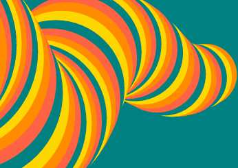
</svg>I also expanded on the SVG version to make an animated "worm" with more overlapping circles. You can see it in this pen : animated worm
And it looks like this :
Solution 2
It is possible to use CSS3 multiple background images and radial gradients together:
#circles {
  width: 115px;
  height: 100px;
  background-image:
    radial-gradient(circle at 50px 50px, #F00 0, #F00 50px, transparent 50px),
    radial-gradient(circle at 55px 50px, #FF0 0, #FF0 50px, transparent 50px),
    radial-gradient(circle at 60px 50px, #080 0, #080 50px, transparent 50px),
    radial-gradient(circle at 65px 50px, #00F 0, #00F 50px, transparent 50px);
}
<div id="circles"></div>Solution 3
Or, if you're feeling crazy, you could make an svg and use it inline as a background image:
#circles {
  width: 120px;
  height: 100px;
  background-image: url("data:image/svg+xml;utf8,<svg version='1.1' xmlns='http://www.w3.org/2000/svg' width='100%' height='100%'><circle fill='blue'  cy='50' cx='70' r='50' /><circle fill='green'  cy='50' cx='65' r='50' /><circle fill='yellow'  cy='50' cx='60' r='50' /><circle fill='red'  cy='50' cx='55' r='50' /></svg>");
}
<div id="circles"></div>Solution 4
You can achieve this by pseudo-selectors like ::before and::after, You can find the jsfiddle https://jsfiddle.net/zakirshaik/jL78m9d1/6/.
You can add shadows to the code to increase the number of circles.
.circle-overlaping{
  width: 100px;
  height: 100px;
  background-color: red;
  border-radius: 50%;
  position:relative;
}

.circle-overlaping::before{
  content: '';
  position: absolute;
  top: 0;
  left: 20px;
  background-color: yellow;
  width: 100px;
  height:100px;
  border-radius: 50%;
}

.circle-overlaping::after{
  content: '';
  position: absolute;
  top: 0;
  left: 40px;
  background-color: blue;
  width: 100px;
  height:100px;
  border-radius: 50%;
}
<div class="circle-overlaping">
</div>
Comments
-
yesman almost 2 years
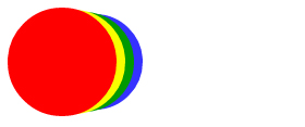
I'm looking to create this overlapping circles shape in CSS:

Basically, just stacked circles. I've looked around, and all solutions I see include using multiple div elements for this effect. However, can't this be done with a single div, using CSS3? I looked at how it could be easily done, and figured that, if all colours are the same, you'd have a pill shape like this:
 #circles {
   background-color: red;
   width: 130px;
   height: 100px;
   border-radius: 50px;
 }
<div id="circles"></div>And then simply draw a couple of quarter moons in it, and you're done. However, I can't figure out how to draw these moon shapes in my capsule shaped div.