html/css hexagon with image inside
Solution 1
With CSS3 almost everything is possible: http://jsfiddle.net/kizu/bhGn4/
There I used different rotations with overflow: hidden, so you can get a cross-browser (well, modern cross-broser) masks that even can be coverable and clickable on the masked area.
Solution 2
The most flexible way of achieving a hexagon with an image is to use an inline SVG :
svg{
  width:30%;
}
<svg viewBox="0 0 100 100" version="1.1" xmlns="http://www.w3.org/2000/svg">
<defs>
<pattern id="img" patternUnits="userSpaceOnUse" width="100" height="100">
<image xlink:href="https://farm9.staticflickr.com/8461/8048823381_0fbc2d8efb.jpg" x="-25" width="150" height="100" />
</pattern>
</defs>
<polygon points="50 1 95 25 95 75 50 99 5 75 5 25" fill="url(#img)"/>
</svg>There are at least two ways of achieving the hexagonal image with SVG :
- making an hexagonal polygon and filling the polygon with an image and the
patternelement (approach I use in the previous snippet) - clipping the image with an hexagonal polygon (see next snippet)
svg{width:30%}<svg viewbox="0 0 100 100" version="1.1" xmlns="http://www.w3.org/2000/svg">
<defs>
<clipPath id="hexClip">
<polygon points="50 1 99 25 99 75 50 99 1 75 1 25"/>
</clipPath>
</defs>
<image xlink:href="https://farm4.staticflickr.com/3165/5733278274_2626612c70.jpg" x="-25" width="150" height="100" clip-path="url(#hexClip)"/>
</svg>The SVG approach allows control over many aspects of the hexagon shape and image. And they can be styled with CSS. Here is an example :
svg{
  width:30%;
  margin:0 auto;
}
#hex{
  stroke-width:2;
  stroke: teal;
  fill-opacity:0.6;
  transition:fill-opacity .8s;
}
svg:hover #hex {
  fill-opacity:1;
}
#text{
  stroke-width:0.5;
  stroke:teal;
  fill-opacity:0.4;
  fill:teal;
  transition:fill-opacity .8s;
}
svg:hover #text{
  fill-opacity:1;
}
<svg viewbox="0 0 100 100" version="1.1" xmlns="http://www.w3.org/2000/svg">
<defs>
<pattern id="img" patternUnits="userSpaceOnUse" width="100" height="100">
<image xlink:href="https://farm9.staticflickr.com/8461/8048823381_0fbc2d8efb.jpg" x="-25" width="150" height="100" />
</pattern>
</defs>
<polygon id="hex" points="50 1 95 25 95 75 50 99 5 75 5 25" fill="url(#img)"/>
<text id="text" font-size="20" x="50" y="50" text-anchor="middle">Some text</text>
</svg>For another approach to make hexagons with an image inside check this question : Responsive grid of hexagons
Solution 3
A new and easy approach would be to use css3 clip-path property.
From Documentation:
The clip-path CSS property prevents a portion of an element from getting displayed by defining a clipping region to be displayed i.e, only a specific region of the element is displayed.
Following css will show a rectangular element in hexagon shape:
div.hexagon {
  clip-path: polygon(50% 0, 100% 25%, 100% 75%, 50% 100%, 0 75%, 0 25%);
}
Output Image:
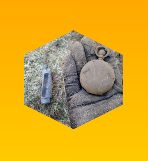
body {
  background: linear-gradient(orange, yellow);
  min-height: 100vh;
  margin: 0;
}
.hexagon {
  clip-path: polygon(50% 0, 100% 25%, 100% 75%, 50% 100%, 0 75%, 0 25%);
  background: url("https://i.imgur.com/waDgcnc.jpg") no-repeat;
  background-size: cover;
  margin: 10px auto;
  height: 200px;
  width: 200px;
}
<div class="hexagon">
</div>We can use this property to draw any shapes that we want. Below are a couple of examples:
div.pentagon {
  clip-path: polygon(50% 0, 100% 45%, 80% 100%, 20% 100%, 0 45%);
}
div.octagon {
  clip-path: polygon(33.33% 0%, 66.66% 0%, 100% 33.33%, 100% 66.66%, 66.66% 100%, 33.33% 100%, 0 66.66%, 0 33.33%);
}
Output Image:

body {
  background: linear-gradient(orange, yellow);
  min-height: 100vh;
  margin: 0;
}
div {
  background: url("https://i.imgur.com/waDgcnc.jpg") no-repeat;
  background-size: cover;
  margin: 10px 20px;
  height: 170px;
  width: 170px;
  float: left;
}

.pentagon {
  clip-path: polygon(50% 0, 100% 45%, 80% 100%, 20% 100%, 0 45%);
}

.octagon {
  clip-path: polygon(33.33% 0%, 66.66% 0%, 100% 33.33%, 100% 66.66%, 66.66% 100%, 33.33% 100%, 0 66.66%, 0 33.33%);
}
<div class="pentagon">
</div>
<div class="octagon">
</div>Note:
clip-pathcss property is not supported in IE and Edge. However future versions of Edge are expected to have support for this property.
Solution 4
You can do it by overlaying corners like this:
http://jsfiddle.net/Eric/kGSCA/3/
HTML:
<div class="hexagon pic">
    <span class="top"></span>
    <span class="bottom"></span>
</div>
CSS:
.hexagon {
    background: url(http://placekitten.com/400/400/);
    width: 400px;
    height: 346px;
    position: relative;
}

.hexagon span {
    position: absolute;
    display: block;
    border-left: 100px solid red;
    border-right: 100px solid red;
    width: 200px;
}

.top {
    top: 0;
    border-bottom: 173px solid transparent;
}

.bottom {
    bottom: 0;
    border-top: 173px solid transparent;
}
Solution 5
here is a simple way if you need only one pic to place.
<style>
.hex{
    width:80px;
    height:80px;
    background-image: url(http://placekitten.com/400/400/);
    background-size: cover;
    position:relative;
    margin:10px;
}
.hex:before, .hex:after{
    content:"";
    position:absolute;
    top:0px;height:40px;width:0px; /* 40 = height/2 */
    z-index:1;
    border:20px solid #FFF; /*change #FFF to your bg color*/
}
.hex:before{
    left:-20px; /* -1*borderWidth */
    border-right:40px solid transparent;/* width/2 */
}
.hex:after{
    left:40px; /* width/2 */
    border-left:40px solid transparent;/* width/2 */
}
</style>
<div class="hex"></div>
need a border ? a background img will be easier & faster.
<div class="hex">
    <div style="position:absolute;top:-20px;left:-20px;bottom:-20px;right:-20px;
        z-index:2;background-image:url(/images/hexagon.png);">
    </div>
</div>
honk31
Updated on July 21, 2020Comments
-
honk31 almost 4 years
Is there a chance to place an image inside a hexagon shape? I'm used to hexagonal shaped cells in html, but I could'nt get it filled with an (background?) image.
Here is what I have tried :
.top {
  height: 0;
  width: 0;
  display: block;
  border: 20px solid red;
  border-top-color: transparent;
  border-right-color: transparent;
  border-bottom-color: red;
  border-left-color: transparent;
}
.middle {
  height: 20px;
  background: red;
  width: 40px;
  display: block;
}
.bottom {
  height: 0;
  width: 0;
  display: block;
  border: 20px solid red;
  border-top-color: red;
  border-right-color: transparent;
  border-bottom-color: transparent;
  border-left-color: transparent;
}
<div class="hexagon pic"> <span class="top" style="background: url(http://placekitten.com/400/400/)"></span> <span class="middle" style="background: url(http://placekitten.com/400/400/)"></span> <span class="bottom" style="background: url(http://placekitten.com/400/400/)"></span> </div> <div class="hexagon"> <span class="top" style="overflow: hidden;"><img src="http://placekitten.com/400/400/" /></span> <span class="middle" style="overflow: hidden;"><img src="http://placekitten.com/400/400/" /></span> <span class="bottom" style="overflow: hidden;"><img src="http://placekitten.com/400/400/" /></span> </div> <div class="hexagon"> <span class="top"><img src="http://placekitten.com/400/400/" /></span> <span class="middle"><img src="http://placekitten.com/400/400/" /></span> <span class="bottom"><img src="http://placekitten.com/400/400/" /></span> </div>here is a fiddle: http://jsfiddle.net/jnz31/kGSCA/