Scrollable div to stick to bottom, when outer div changes in size
Solution 1
2:nd revision of this answer
Your friend here is flex-direction: column-reverse; which does all you ask while align the messages at the bottom of the message container, just like for example Skype and many other chat apps do.
.chat-window{
  display:flex;
  flex-direction:column;
  height:100%;
}
.chat-messages{
  flex: 1;
  height:100%;
  overflow: auto;
  display: flex;
  flex-direction: column-reverse;
}

.chat-input { border-top: 1px solid #999; padding: 20px 5px }
.chat-input-text { width: 60%; min-height: 40px; max-width: 60%; }
The downside with flex-direction: column-reverse; is a bug in IE/Edge/Firefox, where the scrollbar doesn't show, which your can read more about here: Flexbox column-reverse and overflow in Firefox/IE
The upside is you have ~ 90% browser support on mobile/tablets and ~ 65% for desktop, and counting as the bug gets fixed, ...and there is a workaround.
// scroll to bottom
function updateScroll(el){
  el.scrollTop = el.scrollHeight;
}
// only shift-up if at bottom
function scrollAtBottom(el){
  return (el.scrollTop + 5 >= (el.scrollHeight - el.offsetHeight));
}
In the below code snippet I've added the 2 functions from above, to make IE/Edge/Firefox behave in the same way flex-direction: column-reverse; does.
function addContent () {
  var msgdiv = document.getElementById('messages');
  var msgtxt = document.getElementById('inputs');
  var atbottom = scrollAtBottom(msgdiv);

  if (msgtxt.value.length > 0) {
    msgdiv.innerHTML += msgtxt.value + '<br/>';
    msgtxt.value = "";
  } else {
    msgdiv.innerHTML += 'Long long content ' + (tempCounter++) + '!<br/>';
  }

  /* if at bottom and is IE/Edge/Firefox */
  if (atbottom && (!isWebkit || isEdge)) {
    updateScroll(msgdiv);
  }
}

function resizeInput () {
  var msgdiv = document.getElementById('messages');
  var msgtxt = document.getElementById('inputs');
  var atbottom = scrollAtBottom(msgdiv);

  if (msgtxt.style.height == '120px') {
    msgtxt.style.height = 'auto';
  } else {
    msgtxt.style.height = '120px';
  }

  /* if at bottom and is IE/Edge/Firefox */
  if (atbottom && (!isWebkit || isEdge)) {
    updateScroll(msgdiv);
  }
}


/* fix for IE/Edge/Firefox */
var isWebkit = ('WebkitAppearance' in document.documentElement.style);
var isEdge = ('-ms-accelerator' in document.documentElement.style);
var tempCounter = 6;

function updateScroll(el){
  el.scrollTop = el.scrollHeight;
}
function scrollAtBottom(el){
  return (el.scrollTop + 5 >= (el.scrollHeight - el.offsetHeight));
}
html, body { height:100%; margin:0; padding:0; }
.chat-window{
display:flex;
flex-direction:column;
height:100%;
}
.chat-messages{
flex: 1;
height:100%;
overflow: auto;
display: flex;
flex-direction: column-reverse;
}
.chat-input { border-top: 1px solid #999; padding: 20px 5px }
.chat-input-text { width: 60%; min-height: 40px; max-width: 60%; }
/* temp. buttons for demo */
button { width: 12%; height: 44px; margin-left: 5%; vertical-align: top; }
/* begin - fix for hidden scrollbar in IE/Edge/Firefox */
.chat-messages-text{ overflow: auto; }
@media screen and (-webkit-min-device-pixel-ratio:0) {
.chat-messages-text{ overflow: visible; }
/* reset Edge as it identifies itself as webkit */
@supports (-ms-accelerator:true) { .chat-messages-text{ overflow: auto; } }
}
/* hide resize FF */
@-moz-document url-prefix() { .chat-input-text { resize: none } }
/* end - fix for hidden scrollbar in IE/Edge/Firefox */<div class="chat-window">
<div class="chat-messages">
<div class="chat-messages-text" id="messages">
Long long content 1!<br/>
Long long content 2!<br/>
Long long content 3!<br/>
Long long content 4!<br/>
Long long content 5!<br/>
</div>
</div>
<div class="chat-input">
<textarea class="chat-input-text" placeholder="Type your message here..." id="inputs"></textarea>
<button onclick="addContent();">Add msg</button>
<button onclick="resizeInput();">Resize input</button>
</div>
</div>Side note 1: The detection method is not fully tested, but it should work on newer browsers.
Side note 2: Attach a resize event handler for the chat-input might be more efficient then calling the updateScroll function.
Note: Credits to HaZardouS for reusing his html structure
Solution 2
You just need one CSS rule set:
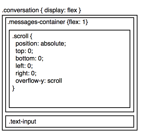
.messages-container, .scroll {transform: scale(1,-1);}
That's it, you're done!
How it works: First, it vertically flips the container element so that the top becomes the bottom (giving us the desired scroll orientation), then it flips the content element so that the messages won't be upside down.
This approach works in all modern browsers. It does have a strange side effect, though: when you use a mouse wheel in the message box, the scroll direction is reversed. This can be fixed with a few lines of JavaScript, as shown below.
Here's a demo and a fiddle to play with:
//Reverse wheel direction
document.querySelector('.messages-container').addEventListener('wheel', function(e) {
  if(e.deltaY) {
    e.preventDefault();
    e.currentTarget.scrollTop -= e.deltaY;
  }
});

//The rest of the JS just handles the test buttons and is not part of the solution
send = function() {
  var inp = document.querySelector('.text-input');
  document.querySelector('.scroll').insertAdjacentHTML('beforeend', '<p>' + inp.value);
  inp.value = '';
  inp.focus();
}
resize = function() {
  var inp = document.querySelector('.text-input');
  inp.style.height = inp.style.height === '50%' ? null : '50%';
}
html,body {height: 100%;margin: 0;}
.conversation {
display: flex;
flex-direction: column;
height: 100%;
}
.messages-container {
flex-shrink: 10;
height: 100%;
overflow: auto;
}
.messages-container, .scroll {transform: scale(1,-1);}
.text-input {resize: vertical;}<div class="conversation">
<div class="messages-container">
<div class="scroll">
<p>Message 1<p>Message 2<p>Message 3<p>Message 4<p>Message 5
<p>Message 6<p>Message 7<p>Message 8<p>Message 9<p>Message 10<p>Message 11<p>Message 12<p>Message 13<p>Message 14<p>Message 15<p>Message 16<p>Message 17<p>Message 18<p>Message 19<p>Message 20
</div>
</div>
<textarea class="text-input" autofocus>Your message</textarea>
<div>
<button id="send" onclick="send();">Send input</button>
<button id="resize" onclick="resize();">Resize input box</button>
</div>
</div>Edit: thanks to @SomeoneSpecial for suggesting a simplification to the scroll code!
Solution 3
Please try the following fiddle - https://jsfiddle.net/Hazardous/bypxg25c/. Although the fiddle is currently using jQuery to grow/resize the text area, the crux is in the flex related styles used for the messages-container and input-container classes -
.messages-container{
  order:1;
  flex:0.9 1 auto;
  overflow-y:auto;
  display:flex;
  flex-direction:row;
  flex-wrap:nowrap;
  justify-content:flex-start;
  align-items:stretch;
  align-content:stretch;
}

.input-container{
  order:2;
  flex:0.1 0 auto;
}
The flex-shrink value is set to 1 for .messages-container and 0 for .input-container. This ensures that messages-container shrinks when there is a reallocation of size.
Solution 4
I've moved text-input within messages, absolute positioned it to the bottom of the container and given messages enough bottom padding to space accordingly.
Run some code to add a class to conversation, which changes the height of text-input and bottom padding of messages using a nice CSS transition animation.
The JavaScript runs a "scrollTo" function at the same time as the CSS transition is running to keep the scroll at the bottom.
When the scroll comes off the bottom again, we remove the class from conversation
Hope this helps.
https://jsfiddle.net/cnvzLfso/5/
var doScollCheck = true;
var objConv = document.querySelector('.conversation');
var objMessages = document.querySelector('.messages');
var objInput = document.querySelector('.text-input');

function scrollTo(element, to, duration) {
  if (duration <= 0) {
    doScollCheck = true;
    return;
  }
  var difference = to - element.scrollTop;
  var perTick = difference / duration * 10;

  setTimeout(function() {
    element.scrollTop = element.scrollTop + perTick;
    if (element.scrollTop === to) {
      doScollCheck = true;
      return;
    }
    scrollTo(element, to, duration - 10);
  }, 10);
}

function resizeInput(atBottom) {
  var className = 'bigger',
    hasClass;
  if (objConv.classList) {
    hasClass = objConv.classList.contains(className);
  } else {
    hasClass = new RegExp('(^| )' + className + '( |$)', 'gi').test(objConv.className);
  }
  if (atBottom) {
    if (!hasClass) {
      doScollCheck = false;
      if (objConv.classList) {
        objConv.classList.add(className);
      } else {
        objConv.className += ' ' + className;
      }
      scrollTo(objMessages, (objMessages.scrollHeight - objMessages.offsetHeight) + 50, 500);
    }
  } else {
    if (hasClass) {
      if (objConv.classList) {
        objConv.classList.remove(className);
      } else {
        objConv.className = objConv.className.replace(new RegExp('(^|\\b)' + className.split(' ').join('|') + '(\\b|$)', 'gi'), ' ');
      }
    }
  }
}

objMessages.addEventListener('scroll', function() {
  if (doScollCheck) {
    var isBottom = ((this.scrollHeight - this.offsetHeight) === this.scrollTop);
    resizeInput(isBottom);
  }
});
html,
body {
height: 100%;
width: 100%;
background: white;
}
body {
margin: 0;
padding: 0;
}
.conversation {
display: flex;
flex-direction: column;
justify-content: space-between;
height: 100%;
position: relative;
}
.messages {
overflow-y: scroll;
padding: 10px 10px 60px 10px;
-webkit-transition: padding .5s;
-moz-transition: padding .5s;
transition: padding .5s;
}
.text-input {
padding: 10px;
-webkit-transition: height .5s;
-moz-transition: height .5s;
transition: height .5s;
position: absolute;
bottom: 0;
height: 50px;
background: white;
}
.conversation.bigger .messages {
padding-bottom: 110px;
}
.conversation.bigger .text-input {
height: 100px;
}
.text-input input {
height: 100%;
}<div class="conversation">
<div class="messages">
<p>
This is a message content
</p>
<p>
This is a message content
</p>
<p>
This is a message content
</p>
<p>
This is a message content
</p>
<p>
This is a message content
</p>
<p>
This is a message content
</p>
<p>
This is a message content
</p>
<p>
This is a message content
</p>
<p>
This is a message content
</p>
<p>
This is a message content
</p>
<p>
This is a message content
</p>
<p>
This is a message content
</p>
<p>
This is a message content
</p>
<p>
This is a message content
</p>
<p>
This is the last message
</p>
<div class="text-input">
<input type="text" />
</div>
</div>
</div>
Stepan Parunashvili
Updated on July 09, 2022Comments
-
Stepan Parunashvili almost 2 years
Here is an example chat app ->
The idea here is to have the
.messages-containertake up as much of the screen as it can. Within.messages-container,.scrollholds the list of messages, and in case there are more messages then the size of the screen, scrolls.Now, consider this case:
- The user scrolls to the bottom of the conversation
- The
.text-input, dynamically gets bigger
Now, instead of the user staying scrolled to the bottom of the conversation, the text-input increases, and they no longer see the bottom.
One way to fix it, if we are using react, calculate the height of text-input, and if anything changes, let .messages-container know
componentDidUpdate() {
  window.setTimeout(_ => {
    const newHeight = this.calcHeight();
    if (newHeight !== this._oldHeight) {
      this.props.onResize();
    }
    this._oldHeight = newHeight;
  });
}
But, this causes visible performance issues, and it's sad to be passing messages around like this.
Is there a better way? Could I use css in such a way, to express that when .text-input-increases, I want to essentially
shift upall of .messages-container -
 Ahmad Baktash Hayeri over 8 yearsHow come both you and @HaZardouS have used the same exact examples?
 -
 Asons over 8 years@AhmadBaktashHayeri Simple, I checked his solution/fiddle before I made mine, to see if it worked well, and then I saw a better way then the one he suggested, so I decided to fix his in the way the OP asked, to make it easy to compare the two.
 -
 hazardous over 8 yearsI'd prefer you credited me when you posted your solution.
 -
Asons over 8 yearsI will credit you for borrowing your html structure, the important part of the CSS is completely rewritten, though I reused the same class names. This is not uncommon that some uses parts of your already posted code, some even make a full copy of it, change 1 line and post it as their own (which I didn't and would never do). If you like, just parse through my older answers and you will find some of them proving I didn't steal your idea here.
-
Stepan Parunashvili over 8 yearsHey HaZardouS, the problem is this: 1) try to scroll to the bottom, and increase input size. blur our, to decrease it. blur back in. Notice that when the input size increases, the conversation is not stuck to the bottom anymore.
-
Stepan Parunashvili over 8 yearsHey @LGSon, the problem is when you are scrolled to the bottom, and the textarea size is increased. You can notice that when you do that, the messages are no longer stuck to the bottom.
-
hazardous over 8 yearsUpdated the code slightly, in the focus event handler the scroll-to-bottom is initiated. Now whenever the input gets focus, the conversation will scroll to the bottom.
-
DoctorDestructo over 8 years@LGSon The last messages are still getting hidden when you resize the input box.
-
Asons over 8 years@DoctorDestructo Yes, and I wrote why/what to do to fix that, which either using the same script that does resize it, or bind a resize event to the textarea, which ever to be preferred. I'm sure the OP is well capable to do that himself, and thanks for the comment, I will update once more with that info.
-
Asons over 8 years@StepanParunashvili I revised my answer and it now match your request for all browsers that don't have the known
scrollbarissue, for the rest, a work-around to try keep same behavior. -
DoctorDestructo over 8 yearsWhy is this getting so many upvotes? In non-Webkit browsers, this solution makes it impossible to scroll in the message pane-- even by select-dragging-- so there's no way to look back at the comments you missed once they've scrolled out of view. That's a pretty show-stopping limitation. I do like the approach otherwise, though. Any possibility of fixing the scrolling issues in IE/Edge/FF?
-
Asons over 8 years@DoctorDestructo If you follow the given instructions, by removing
flex-direction: column-reverse;from the css rule and uncomment the// updateScroll(msgdiv);part in the script, it almost acts the same as in webkit browsers. -
DoctorDestructo over 8 years@LGSon The Webkit-only solution is awesome (except that it's Webkit-only), but I'm finding it difficult to envision an elegant way to implement both it and the JavaScript-based solution at the same time. It almost seems redundant to use both. If you could show the completed cross-platform solution in your answer rather than just describing it, it might be a little easier to see what you have in mind.
-
Stepan Parunashvili over 8 yearsHey @LGSon, I am more then fine with a webkit only solution. But, when the input is resized, It does triggers a scroll, instead of shortering the .conversation. Is that intended? The idea for when input is dynamically changing, is that then the conversation gets smaller
-
Asons over 8 years@StepanParunashvili No, it is not, I will look into it and update you soon.
-
Asons over 8 years@StepanParunashvili Answer updated, my mistake, the
.input-container { height: 80px }had fixed height and need to have fluid.input-container { min-height: 80px } -
DoctorDestructo over 8 years@StepanParunashvili If you're fine with a Webkit-only solution, you should mention that in your question. That would have a very big impact on which of the answers is best, imo.
-
DoctorDestructo over 8 years@LGSon Thanks for the edits; looks better than I was picturing. One last suggestion: add a "resize input" button to your snippet to show that it works when the input box is resized. It doesn't work if I resize the textarea in FF (not that it needs to), and IE doesn't even have resizable textareas, so it's kinda hard to test. Sure, I could write my own test, but since the OP specifically mentioned this scenario in his question, I think a complete answer should cover it. Of course, it becomes a non-issue if he makes his question wk-only. In that case, I'll upvote this answer.
-
Asons over 8 years@DoctorDestructo Thanks again for your comment. I have a complete answer, with a description covering exactly the resize part, still, here is a fiddle for you so you see that it works, jsfiddle.net/7avwkcbk/12, with the extra resize input button. Also, you do realize that the webkit only is because of a bug in Edge/Firefox and not made as a webkit only, and as soon as the bug gets fixed my workaround can just be dropped with the main code intact.
-
DoctorDestructo over 8 years@LGSon I generally wouldn't upvote an answer that has compatibility issues-- whatever their cause-- when there's a more complete cross-platform answer that's already working.
-
Asons over 8 years@DoctorDestructo I made a working solution, so did you, I needed to overcome a bug, you used a hack, bottom line, it is for the OP to select the one he find best solve his needs, so I actually don't understand why you're making remarks on my solution all the time as it is not your call.
-
DoctorDestructo over 8 years@LGSon I suggested ways for you to improve your answer, which is what comments are for. Don't take it so personally. Your answer is better as a result. I've made my point, so I'll stop bugging you now. (We can discuss what qualifies as a "hack" elsewhere if you like).
-
Stepan Parunashvili over 8 years@DoctorDestructo good idea here! I awarded the answer to the other one, mainly because it was possible to not have any js, if done in webkit. This is a great solution though, and I'll remember how nifty it is to use scale for the future
-
DoctorDestructo over 8 years@StepanParunashvili Thanks, glad you like it! And no hard feelings re. your acceptance of LGSon's answer. I'd upvote it myself if you mentioned your browser preference in your question. Otherwise, compatibility is king as far as I'm concerned (but I don't expect everyone to think that way). If you're going with his solution, you might want to check out the bug reports in the SO post he linked. I get the impression that another CSS property (either
justify-contentoralign-content) will eventually be required if Webkit follows the latest spec, but I could be wrong. -
Asons over 8 years@DoctorDestructo The
flex-direction:column; justify-content:flex-enddoes the same asflex-direction: column-reverse; justify-content:flex-startthough the scrollbar is missing in webkit as well, so the missing scroll is an issue that webkit got fixed for the ´column-reverse´ property and the other yet to come. -
DoctorDestructo over 8 years@LGSon I was looking at this message that was linked in one of the bug threads. It specifically says that overflow direction is to be determined by the two properties I just mentioned, and not by the
flex-directionproperty. I would take that to mean that you'd have to add one of those other properties to deal with content that overflows the top of the container rather than the bottom. I might be misinterpreting it, though. Do you read it differently? -
Asons over 8 years@DoctorDestructo Interesting, didn't read that before. You seems to be right here, that
justify-content:flex-endwill be the one for the future to get top overflow. -
DoctorDestructo over 8 years@LGSon But maybe I'm not right :). If
flex-direction: column-reverse;automatically moves theflex-startlocation down to the bottom (which would make sense), then maybe you wouldn't have to explicitly set the justification sinceflex-startis the default. The starting scroll position would be atflex-start, wouldn't it? This is starting to give me a headache. -
Asons over 8 years@DoctorDestructo That is how it works today, on webkit, headache or not :) ... and the
flex-direction:column; justify-content:flex-enddoes the same, though lack scroll in all browsers, webkit included. We'll see what the big guys decides later down their updates/specs to come. -
 HostileFork says dont trust SE about 5 yearsI've used this solution, where plain flexbox wasn't working due to its fixed-size requirement. I'm simultaneously awed at your creativity, and irritated that a UI behavior which should so obviously be the default requires so much work to get! You're a JavaScript enabler--and I mean that with both the good and bad connotations... :-P
 -
Someone Special over 2 yearsA little old, but why can't use
e.currentTarget.scrollTop -= e.deltaY? -
DoctorDestructo over 2 years@SomeoneSpecial Because that would make each click of a typical "clicky" mouse wheel cover way too much ground.
-
DoctorDestructo over 2 years@SomeoneSpecial Actually, you might be onto something. Your simple approach works pretty well once there are a lot of messages in the scroll div. Ok, I'm convinced. Code modified. Thanks for the suggestion!