Select Dropdown going out of screen in mobile view
Solution 1
Since you are using a select element then each phone operating system will render the list of items using its default styling.
iOS example link
Android example link
Solution 2
This is only because of you are check the mobile view in Desktop browser.
In real devices this is not causing any problem and adjust width as per the device width.
and the select options list opens differently as per the OS means in android devices it opens as a drop-down list and in IOs devices it open like a pop-over.
try to open this page in real device not in mobile view of desktop browser.
I hope this answer will clear your all doubts.
Thank you...
Savan Padaliya
Updated on June 06, 2022Comments
-
Savan Padaliya about 2 years
I got select dropdown which is going out of screen in mobile view. I'm using bootstrap class
form-control. My code is as below<select name="service" formControlName="service" class="form-control shadow-none" style="width:100%"> <option value="Select" selected>Select</option> <option value="Sedan" selected>Sedan</option> <option value="SUV" selected>SUV</option> <option value="Mini" selected>Mini</option> </select>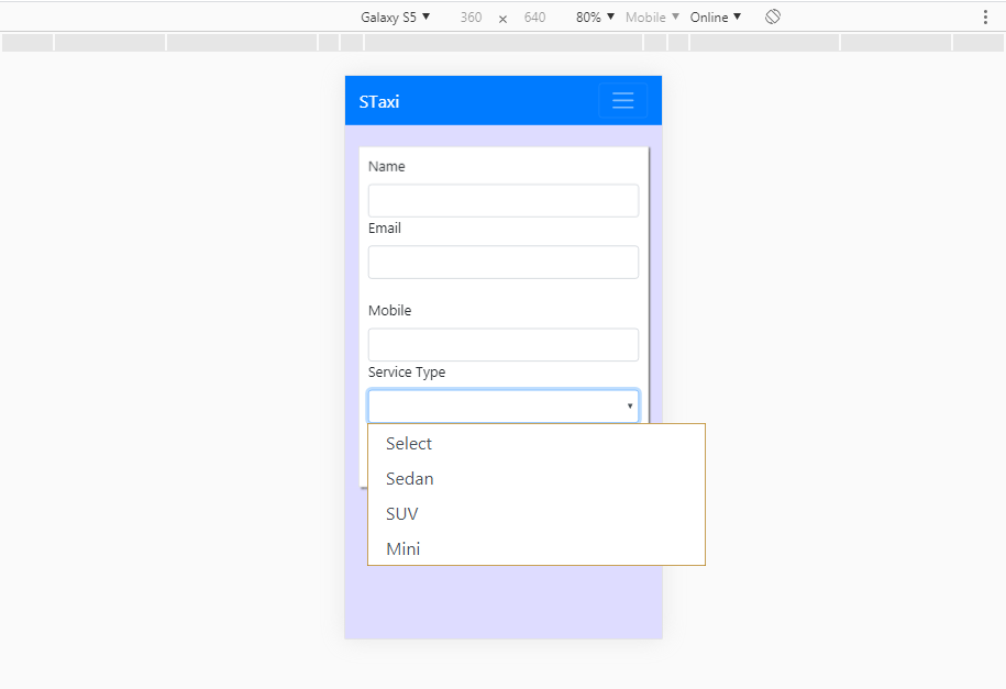
Any kind of help will be appreciated...
-
Savan Padaliya over 4 yearsIt's not working, if i give width or not. I just put in my code to show that I tried by giving width as well.
-
JadeAian over 4 yearstry putting position: absolute with width: 100%. should pull that div outside of the container. You're asking an element to stretch wider than its parent, which is generally not recommended practice.