Bootstrap - Horizontal Scrollbar
Solution 1
It could be:
style="overflow-x:scroll; white-space: nowrap;"
and then in your css:
.col-sm-3{display: inline-block;}
Solution 2
New answer
Building on Alex Coloma's initial answer, but a lil clearer and without inline styles.
Add the following code to your custom CSS file and it should do the trick:
@media (min-width: 992px) {
  .container-fluid {
    overflow-x: scroll;
    white-space: nowrap;
  }
  .col-md-3 {
    display: inline-block;
    vertical-align: top;
    float: none;
  }
}
What does it do and why does it work?
The .container-fluid part gives the wrapper the property to scroll horizontally if there's overflowing content and tells it to NOT wrap ("linebreak") the whitespace between text or in this case child-elements.
The .col-md-3 part "hacks" into Bootstraps grid-system and disables the floating to the left - which was responsible for the linebreak between your fourth and fifth "tree". "display: inline-block" renders your elements in one line and "vertical-align: top" makes it as you may have guessed top-aligned.
Problem
This "hack" renders the bootstrap-grid pretty useless - at least for 3-column elements.
You may wanna give your container an additional class or ID to make the new CSS only target this one container.
e.g.:
@media (min-width: 992px) {
  .container-fluid.my-own-class {
    overflow-x: scroll;
    white-space: nowrap;
  }
  .container-fluid.my-own-class .col-md-3 {
    display: inline-block;
    vertical-align: top;
    float: none;
  }
}
And then finally the line in your HTML would look like this:
<div class="container-fluid my-own-class">
Old answer
The main problem is you're misunderstanding the point of the bootstrap grid-system. You try to wrap 15 columns (5 x col-3) in a 12 column grid.
Yeah, you can do that, but you have to work around the base principle of Bootstrap which would be kinda silly...
Give us little more precise information on what you wanna achieve, what you tried, a demo, etc.
ipln
Updated on June 04, 2022Comments
-
ipln almost 2 years
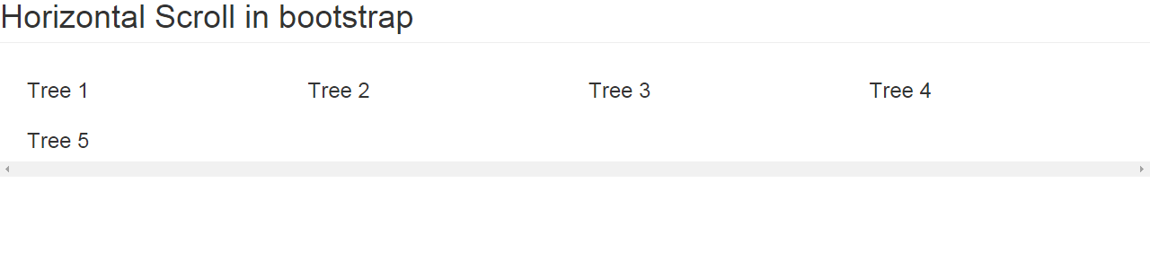
I need horizontal scroll bar for the below code.
<!DOCTYPE html>
<html xmlns="http://www.w3.org/1999/xhtml">
<head>
    <title></title>
    <link href="bootstrap.min.css" rel="stylesheet" />
</head>
<body>
    <h1 class="page-header">Horizontal Scroll in bootstrap</h1>
    <div class="container-fluid" style="overflow-x:scroll;">
        <div class="col-sm-3">
            <h3>Tree 1</h3>

        </div>

        <div class="col-sm-3">
            <h3>Tree 2</h3>

        </div>
        <div class="col-sm-3">
            <h3>Tree 3</h3>

        </div>
        <div class="col-sm-3">
            <h3>Tree 4</h3>

        </div>
        <div class="col-sm-3">
            <h3>Tree 5</h3>

        </div>
    </div>
</body>
</html>
If executed the above line the output shown as the image. But i need Tree 5 after Tree 4. Not below the Tree 1. If i increase Tree 6 it shown as After Tree 5. i.e., I need horizontal scrollbar. Please help me.