Twitter Bootstrap navbar float right moves div to new line
Solution 1
In order to be placed at the top level of nav-bar, the contents must be placed inside of a div with the class: navbar-header
So instead of declaring the logout link inside of the div:
<div class="navbar-right">
Use the following classes instead:
<div class="navbar-header pull-right">
Since you'll want the Brand to pull-left, you can place two navbar-header divs right next to each other at the very top and have one pull to each direction. Like this:
<div class="navbar-header pull-left">
    <a class="navbar-brand" href="index.php">xxx</a>
</div>
<div class="navbar-header pull-right">
    <button type="button" class="navbar-toggle"
            data-toggle="collapse" data-target=".navbar-collapse">
        <span class="icon-bar"></span>
        <span class="icon-bar"></span>
        <span class="icon-bar"></span>
    </button>
    <p class="navbar-text">
        <b> '.$username.' </b>
        <a href="logout.php" class="navbar-link">Logout</a>
    </p>
</div>
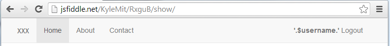
jsFiddle
Expanded
Collapsed

Update: As per Ram's comment, in order to not have the pull down menu not overlap on a small screen, you'll have to clear the left float like this:
.navbar-collapse.in,
.navbar-collapse.collapsing {
    clear: left;
}
Solution 2
Instead of,
<div class="navbar-right">
  <p>
    <b> '.$username.' </b> | Access Level: '.$level.' | <a href=logout.php>Logout</a>
  </p>
</div>
Use,
<p class="pull-right">
    <b> '.$username.' </b> | Access Level: '.$level.' | <a href=logout.php>Logout</a>
</p>
Related videos on Youtube
 02 : 54
 13 : 57
 17 : 59
 01 : 52
 01 : 40
alchuang
I care about people. I enjoy solving challenges with technology. I find gratification in making lives easier by building functional and thoughtful applications.
Updated on August 02, 2022Comments
-
alchuang 5 months
Hello I'm trying to create a section on the right of the navbar. I used the div class navbar-right which should float the div to the right, but I am getting a new line instead.
See below for code & thanks!
<div class="navbar navbar-default navbar-fixed-top"> <div class="container"> <div class="navbar-header"> <button type="button" class="navbar-toggle" data-toggle="collapse" data-target=".navbar-collapse"> <span class="icon-bar"></span> <span class="icon-bar"></span> <span class="icon-bar"></span> </button> <a class="navbar-brand" href="index.php">xxx</a> </div> <div class="navbar-collapse collapse"> <ul class="nav navbar-nav"> <li class="active"><a href="index.php">Home</a></li> <li><a href="about.php">About</a></li> <li><a href="contact.php">Contact</a></li> </ul> </div> <div class="navbar-right"> <p> <b> '.$username.' </b> | Access Level: '.$level.' | <a href=logout.php>Logout</a> </p> </div> </div> </div> -
 Ram over 7 yearsThanks for the answer. I have quick question. How to fix the navbar-collapse menu in mobile view which now overlaps the navbar header instead of being displayed below it?