How to use bootstrap to hide one of div when zoom browser windows size smaller
17,832
Solution 1
This is a working code, I have tested..
    <div class="row">
    <div class="col-md-4">.col-md-4</div>
    <div class="col-md-4 ">.col-md-4</div>
    <div class="col-md-4 visible-lg">.col-md-4</div>
    </div>
Solution 2
Right Answer for Bootstrap 3
Use utility classes for showing and hiding content by decice via media query. Try to use thses on a limited basis and avoid creating entirely differnet versions of the smae site. Instead, use them to complement each device's presentation.
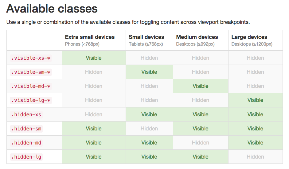
Source: http://getbootstrap.com/css/#responsive-utilities
Author by
Jerry Cai
Updated on June 26, 2022Comments
-
Jerry Cai almost 2 years
I use bootstrap to design my web UI , and now I have a requirement as below:
I define the below div structure as their div ids are : part1 and part2
    <div class="container">
        <div class="panel panel-default">
            <div class="panel-body">
                <div id="part1" class="col-md-6">
                    <div>
                        xxxx
                    </div>
                </div>
                <div id="part2" class="col-md-6">
                    <div>
                        yyy
                    </div>
                </div>
            </div>
        </div>
    </div>
Now I want to hide the part1 automatically when shrink browser window size or my phone browser , How can I achieve this effect ?
BTW: I try to add css "collapse" to part1 as , but it hide directly even my browser is larger .
-
Jerry Cai over 10 yearsThanks for your solutions , but it still can't hidden when I resize my browser become smaller .
-
Prasanna Aarthi over 10 yearswhat version of bootstrap are you using? have you included bootstrap-responsive.css
-
Jerry Cai over 10 yearsHi, Prasanna , I use the bootstrap 3.0
-
Prasanna Aarthi over 10 yearsFor bootstrap 3.0 use class="hidden-sm" or "hidden-md" the previous code was for older version of bootstrap
-
Jerry Cai over 10 yearsBut it still can't work , Could you provider a tested code for me ? thanks a lot .
-
Jerry Cai over 10 yearsYes , it works , but it's behavior is strange or un-expected , Since if I resize the browser on md size , it works , but when I continue resize browser size to more smaller as sm , but it can't be hidden . Do you know something about the min-size or max-size related features ? I am a fresh man on web design and bootstrap , thank you in advance .
-
Prasanna Aarthi over 10 yearsIf you need a solution using min-widtha and max-width, you need to use media queries
-
Jerry Cai over 10 yearsCould you give me a brief demo code based on bootstrap ? Thank you again .
-
Prasanna Aarthi over 10 yearsRefer the link <stackoverflow.com/questions/6370690/…> in your media query add #urid{display:none}
-
Prasanna Aarthi over 10 yearsThis code resolves the issue with small screen sizes also, try this <div class="row"> <div class="col-md-4">.col-md-4</div> <div class="col-md-4 ">.col-md-4</div> <div class="col-md-4 visible-lg">.col-md-4</div> </div>
-
Jerry Cai over 10 yearsThank you so much , Prasana . Seems visiable-* works as my expected . another question is : actually , we are depressed to use media query , right ? since it will have lot of mantain effort , I think .
-
Jerry Cai over 10 yearsActually , I feel that bootstrap is fulfil my daily requirments largely with very simple solutions , and it can reduce my effort to design the web application . but How to integration and have conflict with Jquery maybe a problem , sometimes , I want to use the Jquery UI too. Do you have more further experience ?
-
rahulthewall almost 10 years@PrasannaAarthi Thanks for that bit of information, worked perfectly for me.
-
m4f1050 almost 8 yearsLike Prasanna mentioned, are you loading the bootstrap codes properly?