ggplot bar chart for time series
Solution 1
Hope this is what you are looking for:
ggplot2 requires data in a long format.
require(reshape2)
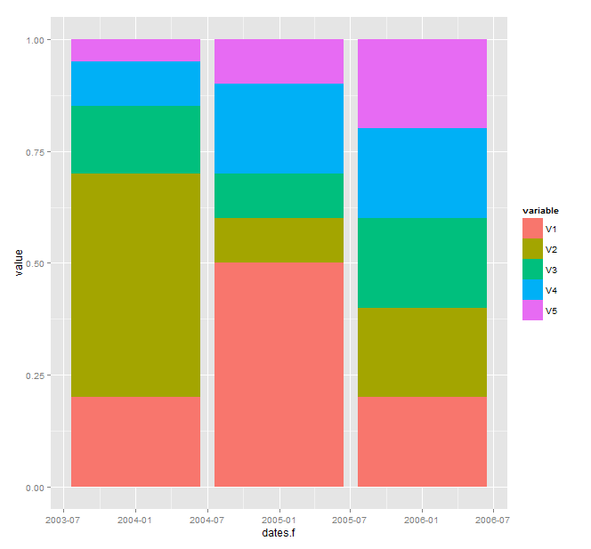
m_molten <- melt(m, "dates.f")
Plotting itself is done by
ggplot(m_molten, aes(x=dates.f, y=value, fill=variable)) +
  geom_bar(stat="identity")
You can add position="dodge" to geom_bar if you want then side by side.
EDIT
If you want yearly breaks only: convert m_molten$dates.f to date.
require(scales)
m_molten$dates.f <- as.Date(m_molten$dates.f)
ggplot(m_molten, aes(x=dates.f, y=value, fill=variable)) +
  geom_bar(stat="identity") +
  scale_x_date(labels = date_format("%y"), breaks = date_breaks("year"))
P.S.: See http://vita.had.co.nz/papers/tidy-data.pdf for Hadley's philosophy of tidy data.
Solution 2
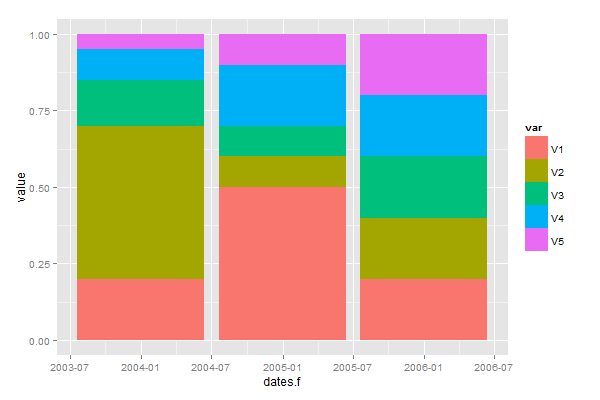
To create the plot you need, you have to reshape your data from "wide" to "tall". There are many ways of doing this, including the reshape() function in base R (not recommended), reshape2 and tidyr.
In the tidyr package you have two functions to reshape data, gather() and spread().
The function gather() transforms from wide to tall. In this case, you have to gather your columns V1:V5.
Try this:
library("tidyr")
tidy_m <- gather(m, var, value, V1:V5)
ggplot(tidy_m,aes(x = dates.f, y=value, fill=var)) +
  geom_bar(stat="identity")
Related videos on Youtube
 09 : 11
 11 : 37
math
Updated on June 04, 2022Comments
-
 math over 1 year
I'm reading the book by Hadley Wickham about ggplot, but I have trouble to plot certain weights over time in a bar chart. Here is sample data:
dates <- c("20040101","20050101","20060101")
dates.f <- strptime(dates,format="%Y%m%d")
m <- rbind(c(0.2,0.5,0.15,0.1,0.05),c(0.5,0.1,0.1,0.2,0.1),c(0.2,0.2,0.2,0.2,0.2))
m <- cbind(dates.f,as.data.frame(m))
This data.frame has in the first column the dates and each row the corresponding weights. I would like to plot the weights for each year in a bar chart using the "fill" argument.
I'm able to plot the weights as bars using:
p <- ggplot(m,aes(dates.f))
p+geom_bar()
However, this is not exactly what I want. I would like to see in each bar the contribution of each weight. Moreover, I don't understand why I have the strange format on the x-axis, i.e. why there is "2004-07" and "2005-07" displayed.
Thanks for the help
-
math over 8 yearsmaybe one small question: I wanted to change the labels via
scale_x_date(lables=date_format("%y")). This is gives an error that it cant find the function date_format. How can I just display 04, 05,06?