How to add means to a ggplot + geom_point plot
Solution 1
You can pass another geom_point with another data.frame:
Try the following:
df_means <- melt(summarise_all(df, mean))
ggplot(data = melt(df)) +
    geom_point(mapping = aes(x = variable, y = value)) +
    geom_point(data=df_means,  mapping=aes(x = variable, y = value), col="red")

I shtat what you were looking for?
By the way a more compact/modern/tidyversy way would be:
library(tidyverse)
set.seed(1234)
df <- replicate(10, rnorm(10)) %>% as_data_frame() %>% gather()
df_means <- df %>% group_by(key) %>% summarise(value=mean(value))
ggplot(data = df) +
   aes(x = key, y = value) +
   geom_point() +
   geom_point(data=df_means, col="red")
Solution 2
Or we can use stat_summary
ggplot(data = reshape2::melt(df), aes(x = variable, y = value)) +
  geom_point() +
  stat_summary(
    geom = "point",
    fun.y = "mean",
    col = "black",
    size = 3,
    shape = 24,
    fill = "red"
  )
An overview about possible shapes can be found here: www.cookbook-r.com
Solution 3
Updated code to reflect changes in tidyverse from previous comments.
As tidyverse has updated its syntax, below is the updated versions for dplyr and ggplot2. Thank you, @Vincent Bonhomme and @markus.
For reproducibility, I will copy their examples.
library(tidyverse)
# Dataset Generation
set.seed(1234)
df <- replicate(10, rnorm(10)) %>%
  as_data_frame() %>%
  pivot_longer(cols = everything(), names_to = "variable", values_to = "value") %>% # ** Change here
  mutate(group = as.factor(rep(1:5, 20)))
#Option 1: Use stat_summary() for a cleaner version (@Vincent Bonhomme)
ggplot(df,  aes(x = variable, y = value)) +
  geom_point() +
  stat_summary(
    fun = "mean",        #argument updated in new version.
    geom = "point",
    col = "black",
    size = 3,
    shape = 24,
    fill = "red"
  ) +
ggtitle("Example")
#Option 2 -- Creating a means dataset (@ markus)
df_means <- df %>% group_by(variable) %>% summarise(value=mean(value))
ggplot(data = df) +
  aes(x = variable, y = value) +
  geom_point() +
  geom_point(data=df_means,
col="red",
size = 3,
    shape = 24,
    fill = "red") +
  ggtitle("Example")
Both create the same graph
Here are the versions used
dplyr       * 1.0.3
ggplot2     * 3.3.3
Jean_N
Updated on June 15, 2022Comments
-
 Jean_N over 1 year
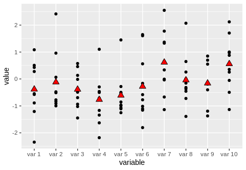
I have 10 groups of data points and I am trying to add the mean to for each group to be displayed on the plot (e.g. by a different symbol such as a big triangle or a star or something similar). Here is a reproducible example
library(ggplot2)
library(reshape2)
set.seed(1234)
x <- matrix(rnorm(100),10,10)
varnames <- paste("var", seq(1,10))
df <- data.frame(x)
colnames(df) <- varnames
melt(df)
ggplot(data = melt(df)) + geom_point(mapping = aes(x = variable, y = value))
mymeans <- colMeans(df)
Basically I now want to have the values in
mymeansplotted in their respective variable location, would anybody have an idea how to quickly do this? -
 tjebo over 2 years1) I find the suggestion of merging data with its own aggregated data quite dangerous practice. 2) this answer actually exactly reproduces user Vincent Bonhommes answer stackoverflow.com/a/52217979/7941188 , just adding some more lines of code.
 -
tjebo over 2 yearsthat's nice, except you confused the users :D
-
 Make42 over 2 years@tjebo: 1) Why? You should be aware that the resulting data.frame is just for plotting and be aware about what it contains. Keeping stuff like that in mind is pretty basic in programming.